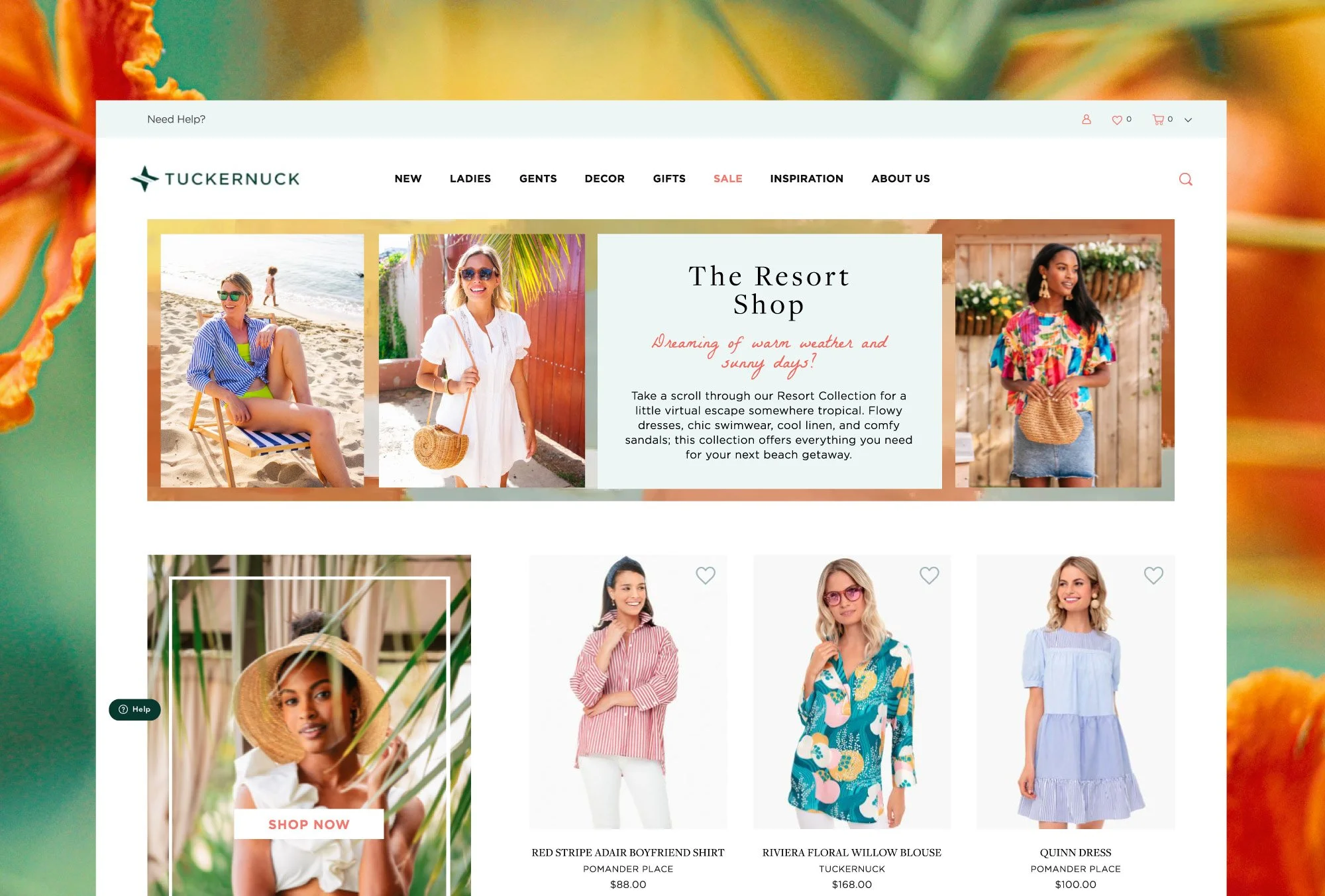
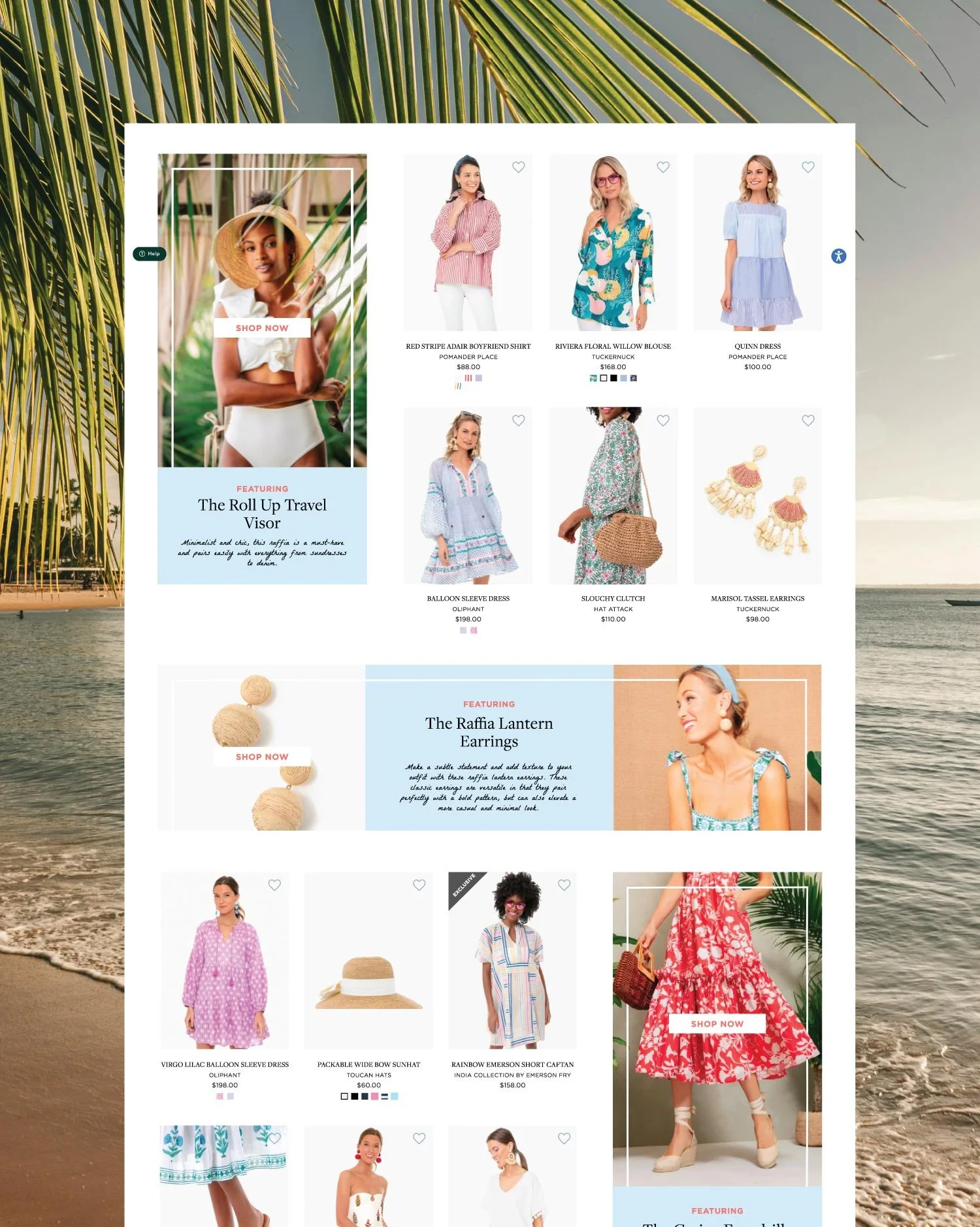
A digital marketing campaign designed to bring Tuckernuck's Resort Shop collection to life.
Tuckernuck is an online clothing boutique with a brick-and-mortar store in Georgetown, Washington DC, known for its preppy, classic, and coastal aesthetic and carefully curated collections. This project was an opportunity to interpret the brand's visual identity with a personal creative lens, designing a cohesive suite of digital marketing content for the Resort Shop collection.
OVERVIEW
STACK
Illustrator
Photoshop
Figma
CLIENT
Tuckernuck
CREDITS
↓ Yasmine Bouchlaghem
Web Design · UI/UX Design · Email Marketing Design · Social Media Design · Project Management
INDUSTRY
Fashion, Apparel & Lifestyle
SERVICES
Web Design
UI/UX Design
Email Marketing Design
Social Media Design
Project Management
THE CHALLENGE
Designing within an established brand's visual identity requires a specific kind of discipline. The work had to feel unmistakably Tuckernuck in tone, palette, and voice while still bringing something considered and creatively distinct to the table. The challenge was finding that balance: honoring the brand's guidelines closely enough that the designs could live natively within their ecosystem, while expressing a personal interpretation that went beyond simply replicating what already existed.
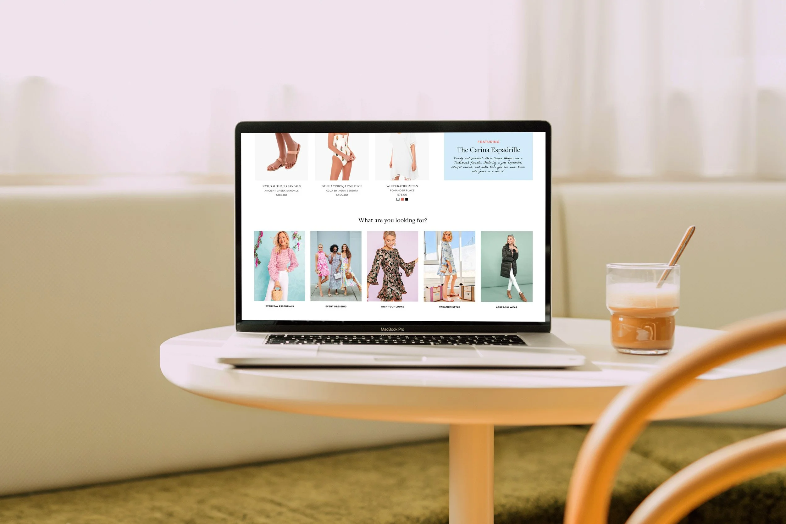
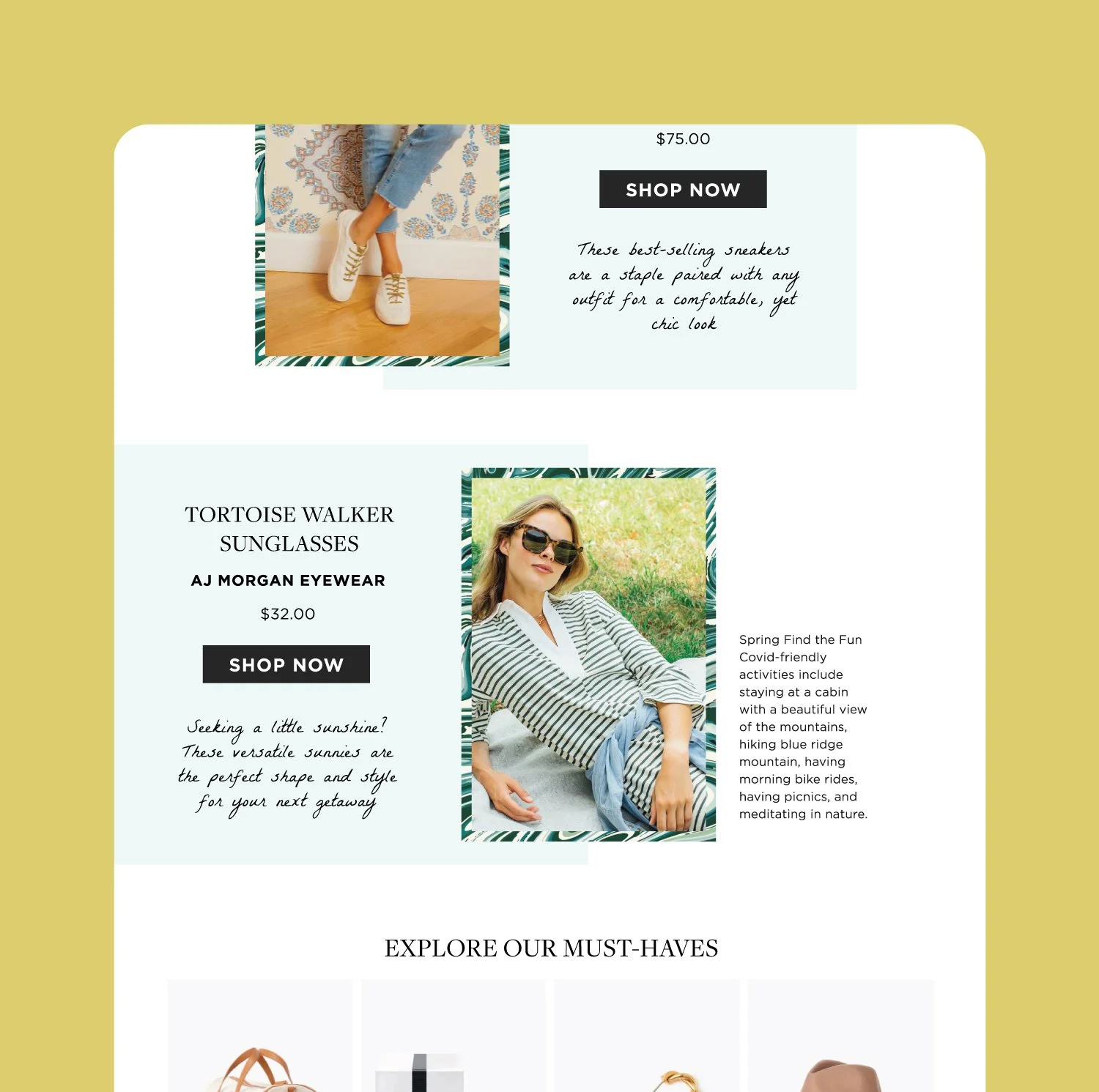
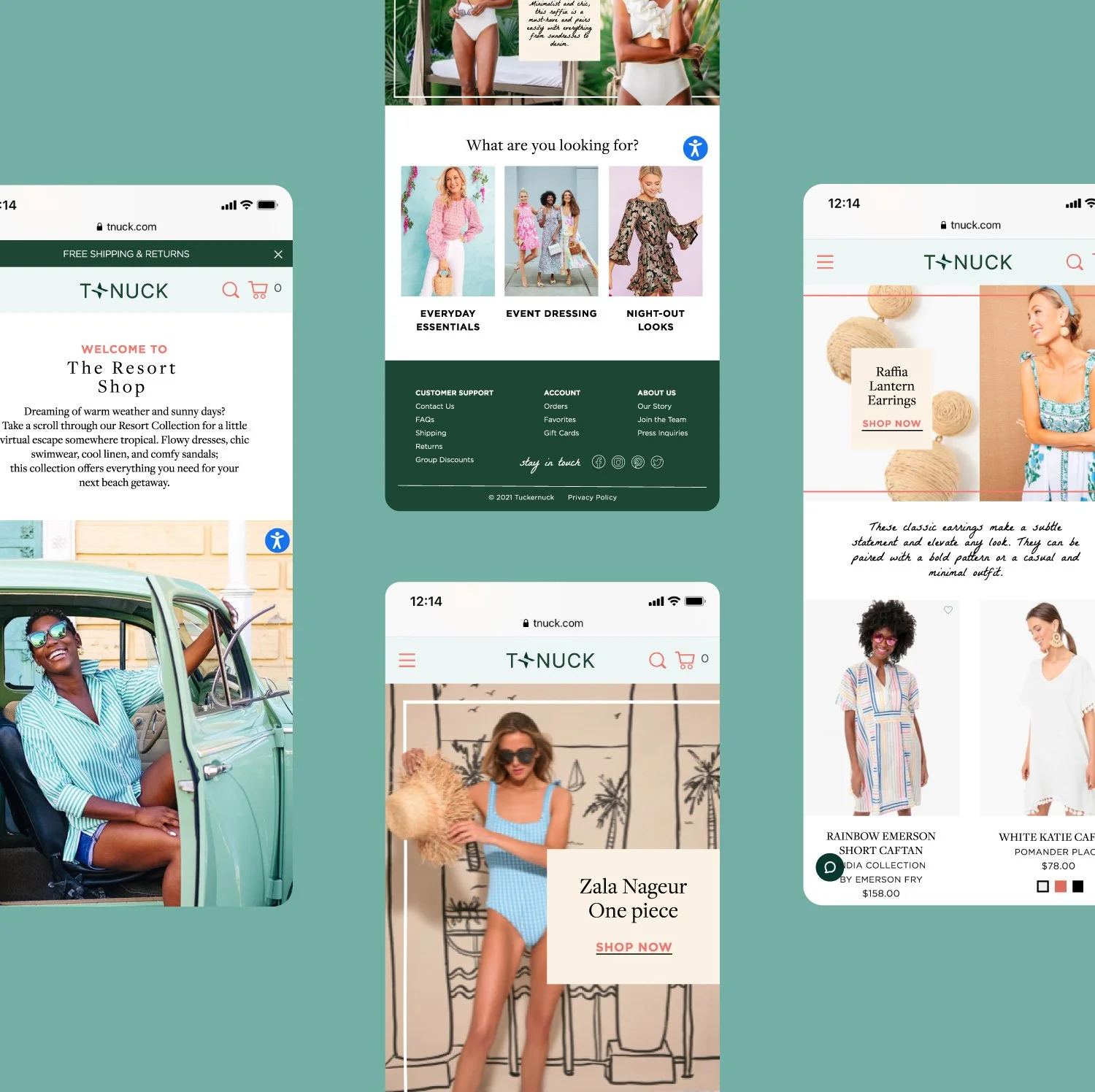
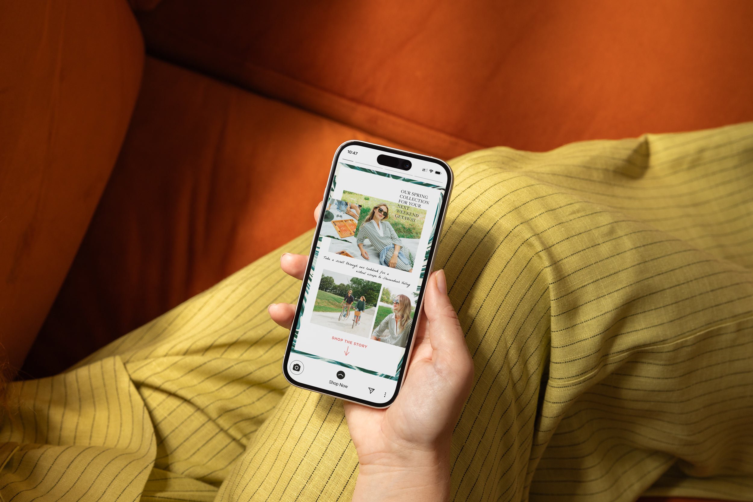
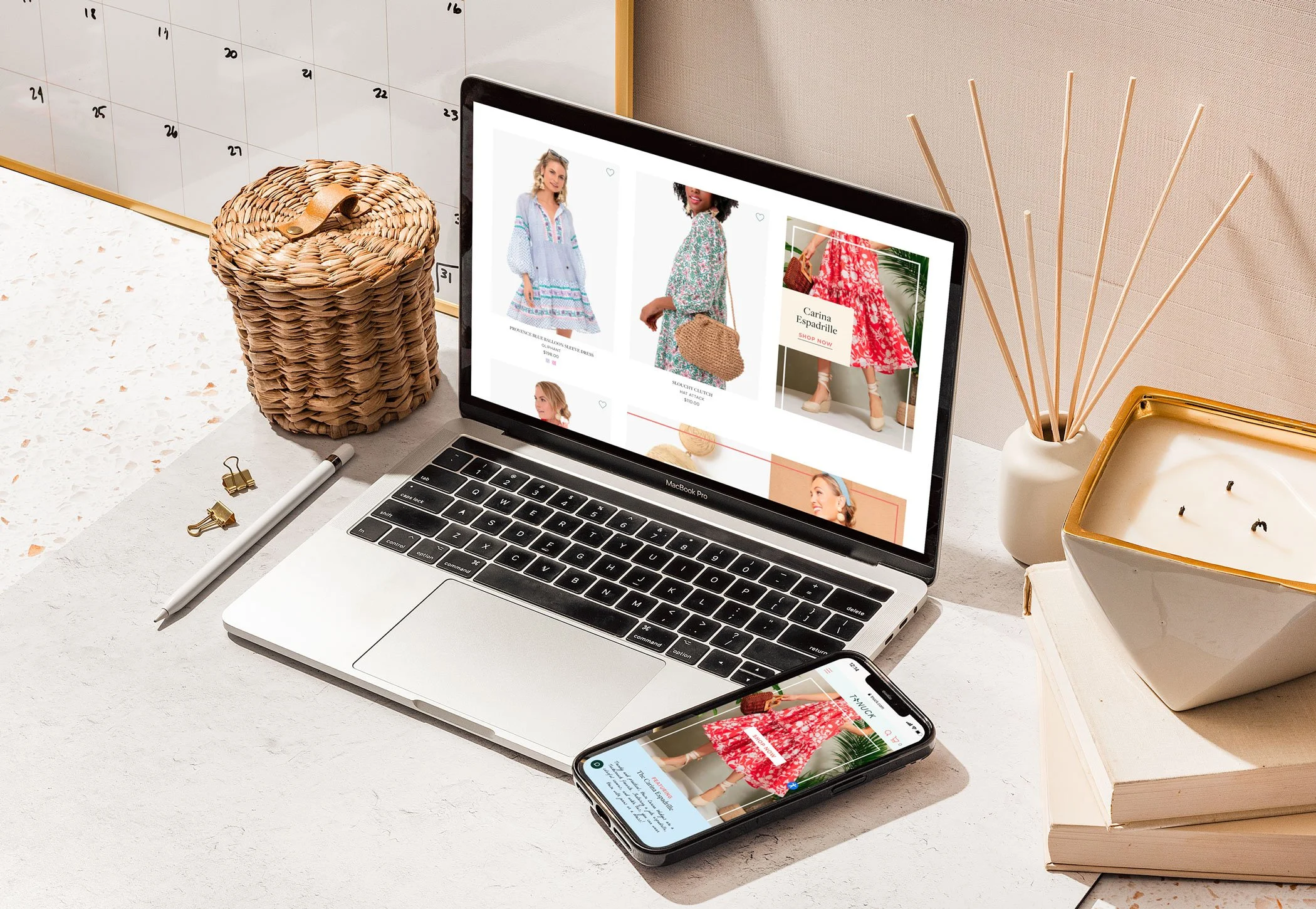
The scope spanned three distinct formats: website content blocks, an email newsletter, and an Instagram story, each with its own layout conventions, and content hierarchy. Maintaining visual consistency across all three while respecting the unique requirements of each format was central to the design problem.
THE STRATEGIC APPROACH
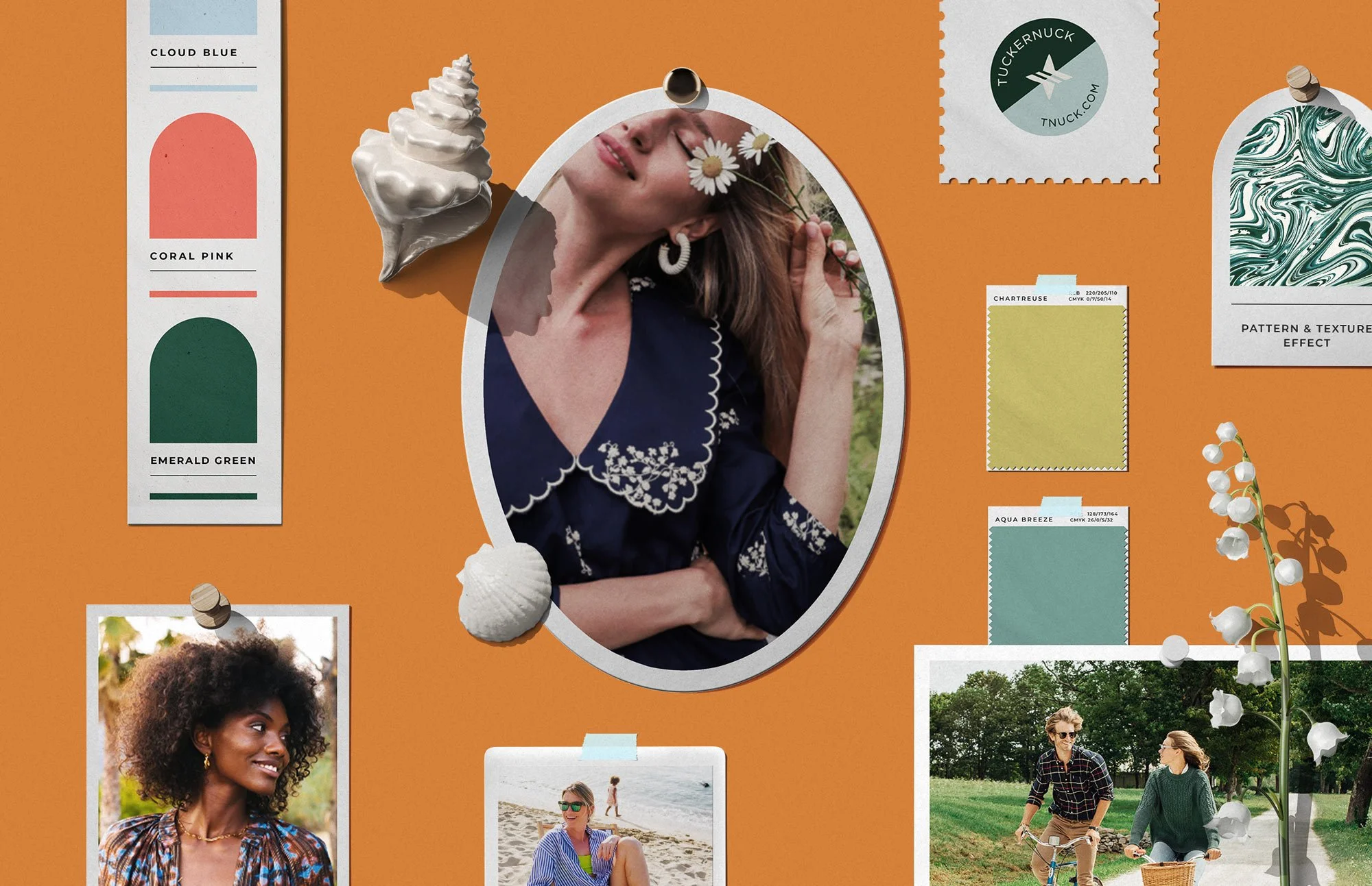
Before focusing on the visual layouts, she immersed herself in the Tuckernuck brand, studying the visual language, tone of voice, typography, and the way the brand presented its collections across digital touchpoints. Understanding not just what the brand looked like, but how it communicated, was essential to designing something that felt genuinely native.
The Resort Shop collection provided a clear creative anchor. The seasonal, aspirational nature of a resort collection called for a visual approach rooted in feeling rather than product, one that placed the customer inside a world they wanted to inhabit rather than simply presenting clothes to purchase. That lens shaped every layout, image, and typographic choice, giving the designs a sense of place and mood that sat naturally within Tuckernuck's lifestyle-focused target audience.
THE DESIGN PROCESS
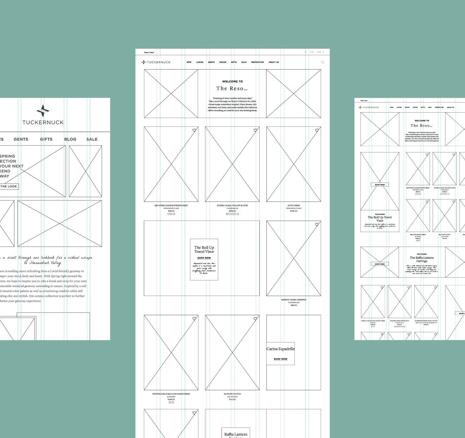
The process began with wireframes for both the email newsletter and website content blocks, built on a grid structure that established the information architecture and visual hierarchy before any styling was applied. Working from a grid ensured that content flow, alignment, and hierarchy were resolved structurally first, giving the final designs a sense of clarity and order.
With the structure in place, she moved into the visual design, bringing the wireframe foundations to life with a personal creative perspective that honored Tuckernuck's classic, coastal identity while giving the Resort Shop its own distinct character within the brand. Photography selection, typographic treatment, layout pacing, and carefully chosen textures were all considered in tandem, adding depth and personality to the designs while reinforcing the aspirational mood of the collection. Every detail was handled with intention, ensuring the Resort Shop felt like a destination within the brand rather than just another seasonal drop.
The Instagram story extended the visual language of the email newsletter into a vertical, mobile-first format, requiring hierarchy and imagery to be rethought for a context where attention is measured in seconds. Each deliverable was designed to feel like a natural part of the same campaign while holding its own within its platform.
THE OUTCOME
The Resort Shop came to life across every format it touched. Each deliverable brought its own dimension to the collection: the website content blocks gave it visual presence, the email newsletter gave it narrative, and the Instagram story gave it immediacy. Together they created something that felt less like a marketing campaign and more like an invitation into a world Tuckernuck's customer already wanted to be part of. The cohesion across all three formats was a deliberate outcome of treating the campaign as a single creative vision from the start, where every layout decision, image choice, and typographic detail was made with the full picture in mind instead of one deliverable at a time.
Designed to make Tuckernuck's Resort Shop feel less like a collection and more like a destination.
Every asset sourced, designed, and produced independently from concept to final delivery.
Each layout began as a wireframe, ensuring structure and intention guided every visual decision.