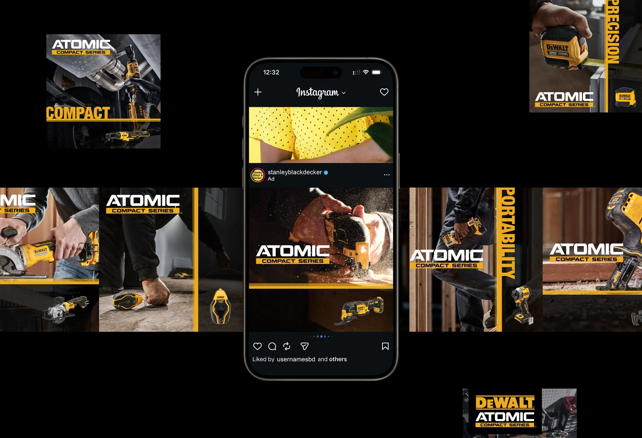
Crafted key art & social carousel to distinguish DeWalt’s Atomic sub-brand and showcase its full range.
DeWalt's Atomic sub-brand occupies a specific position within a large and well-established product family. Designing for a sub-brand means working within a defined visual ecosystem while still carving out something distinct and ownable. This project called for key art and a Facebook social carousel that could do exactly that: showcase the Atomic product range with clarity, confidence, and a visual language all its own.
OVERVIEW
CREDITS
Graphic Design · Social Media Design · Project Management → Yasmine Bouchlaghem
Marketing & Creative Direction → Jim McNulty
INDUSTRY
Manufacturing
SERVICES
Digital Design
Social Media Design
Graphic Design
STACK
Photoshop
Illustrator
CLIENT
Stanley Black & Decker


THE CHALLENGE
Within a brand as established as DeWalt, sub-brands face a particular design challenge. They need to feel cohesive with the parent brand while standing apart from it and from each other. For the Atomic sub-brand, the purpose was to develop a visual approach that honored the DeWalt identity without blending into it.
The deliverables added their own layer of complexity. Key art and social carousels serve different purposes and live in different contexts, yet both needed to feel like they came from the same creative vision, communicating the Atomic range with consistency across every format.
THE STRATEGIC APPROACH
Before any design work began, she immersed herself in the Atomic sub-brand, reviewing brand guidelines and strategy decks covering each of the featured products. That research established the foundation for every decision that followed, ensuring the work stayed true to the brand's positioning while leaving room for the creative to breathe.
The strategic goal was clear: develop a dark, high-contrast visual system that could set Atomic apart from the broader DeWalt family and other sub-brands, without losing the brand equity that makes DeWalt instantly recognizable. Every texture, layout choice, and visual effect would need to serve that distinction.
THE DESIGN PROCESS
Working under the creative director, she began exploring how texture, visual effects, and layout could be used to build a distinct Atomic aesthetic. Rather than defaulting to the standard DeWalt visual language, the process involved deliberate experimentation, testing different combinations of dark, high-contrast treatments and compositions until a direction emerged that felt both ownable and on-brand.
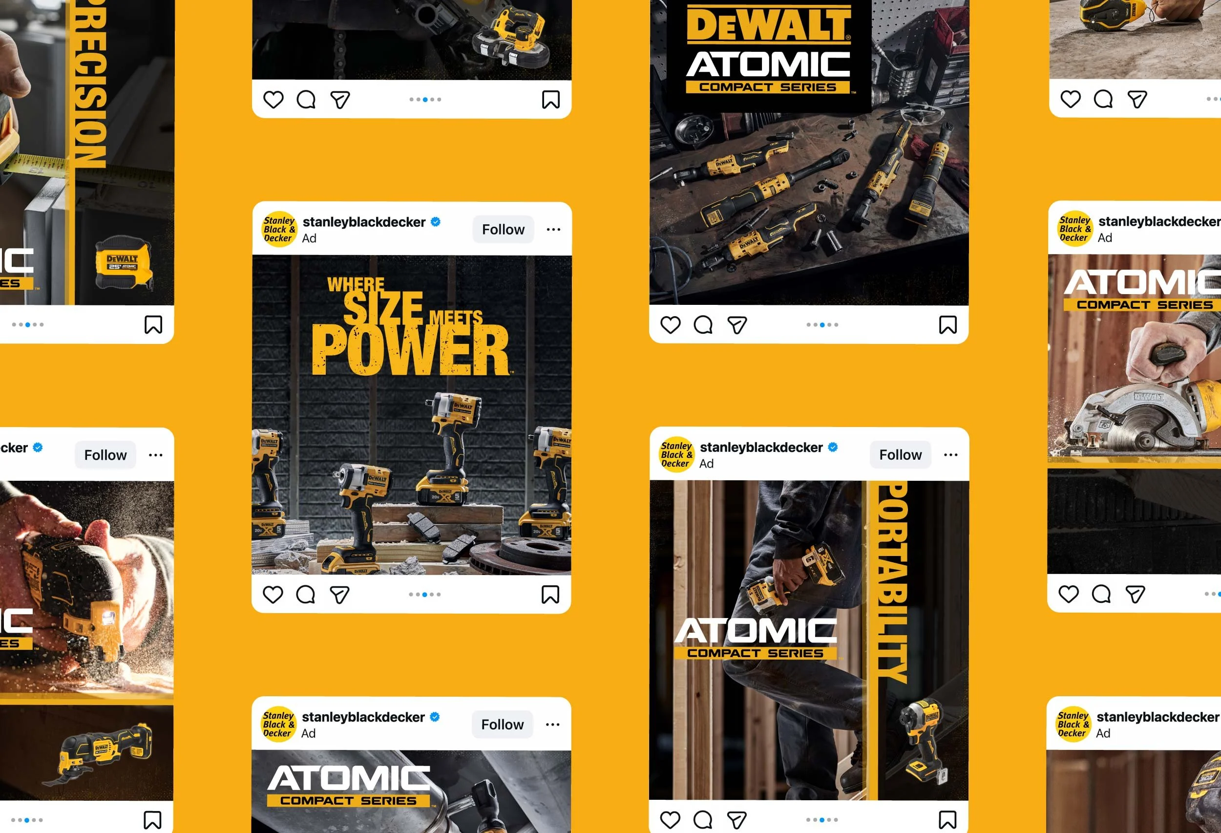
The key art was developed as two variations of the same creative direction, each placing the Atomic product range in a pattern-driven composition alongside the Atomic logo and tagline. Presenting two refined variations rather than two separate concepts gave the client a focused and considered set of options, both strong enough to stand alone while sharing the same visual foundation.
The 10-post Facebook carousel required a different kind of thinking. Each card needed to showcase an individual product while contributing to a cohesive sequential experience across the full set. Highlighting product features within each post meant balancing informational clarity with visual impact, ensuring that every card worked both in isolation and as part of the larger carousel narrative.
THE OUTCOME
The final deliverables gave Stanley Black & Decker a focused, visually distinctive creative platform for the Atomic sub-brand. The two key art variations provided the client with a refined set of directions to choose from, while the 10-post social carousel gave the Atomic product range a cohesive, engaging presence on Meta that clearly communicated each product's capabilities and uses.
Together, the deliverables demonstrated that a sub-brand can hold its own visual identity without stepping outside the boundaries of the parent brand, striking a thoughtful balance between differentiation and consistency while reinforcing overall brand recognition.