A social media takeover campaign that made NatGeo Wild's SharkFest impossible to scroll past.
OVERVIEW
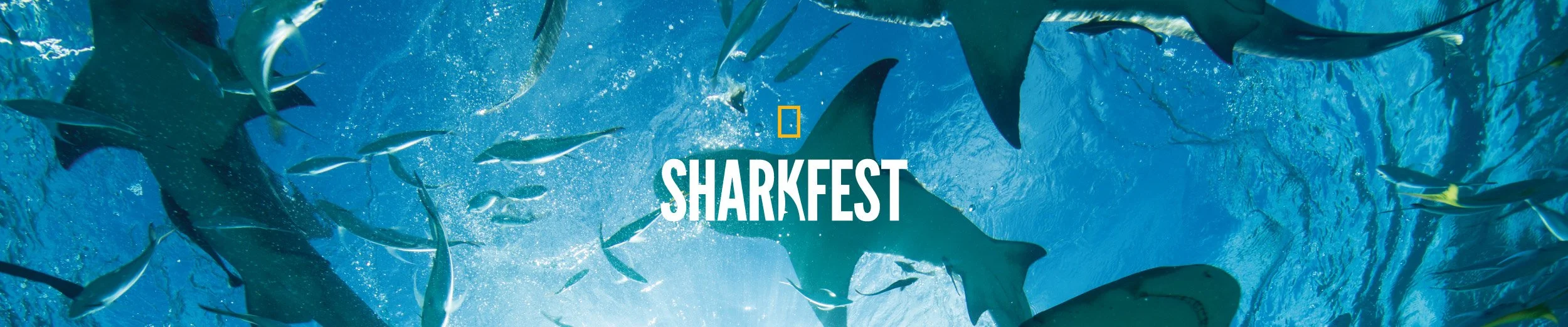
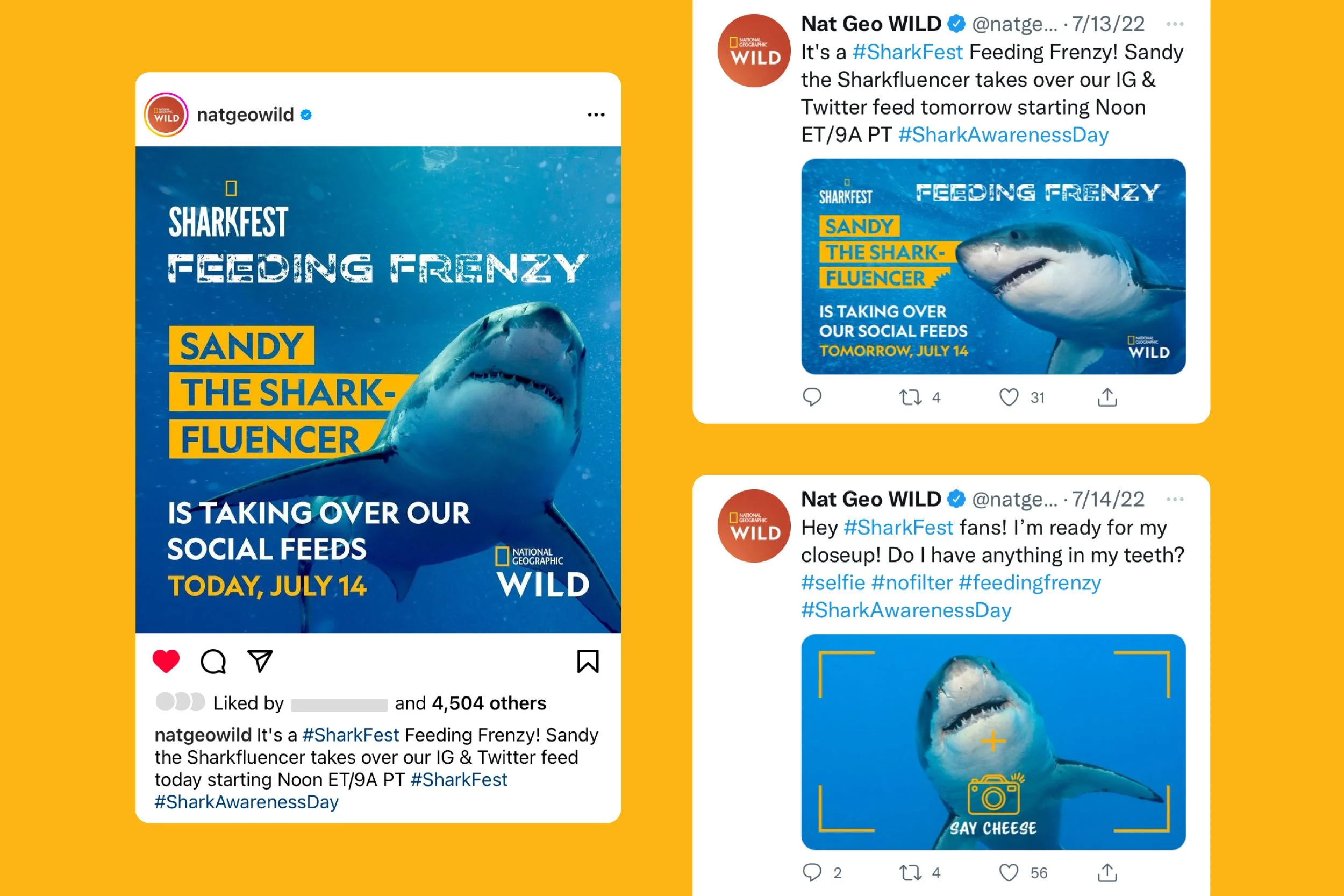
SharkFest is one of National Geographic's most anticipated annual events, and in 2022, the goal was to make it the only thing worth talking about online. Rather than relying on traditional promotional content, the team pitched and executed a concept built around a character: Sandy, a self-proclaimed "Sharkfluencer" taking over NatGeo Wild's social accounts for the day. The campaign needed to feel native to the platform, true to the NatGeo brand, and bold enough to stop the scroll on one of the internet's busiest days for shark content.
STACK
Photoshop
Illustrator
InDesign
Google Slides
CLIENT
National Geographic
INDUSTRY
Entertainment
CREDITS
Pitch Deck Design · Graphic Design · Social Media Strategy & Design → Yasmine Bouchlaghem
Marketing & Creative Direction · Copywriting → Jim McNulty
SERVICES
· Pitch Deck Design
· Social Media Strategy
· Social Media Design
· Graphic Design
THE CHALLENGE
Social media campaigns for major media brands face a specific kind of pressure. The content has to perform within the platform's native environment while still meeting the expectations of an established brand with a global audience. For SharkFest, the additional challenge was tone: the campaign needed to be playful and personality-driven without feeling off-brand for an organization known for serious, world-class storytelling.
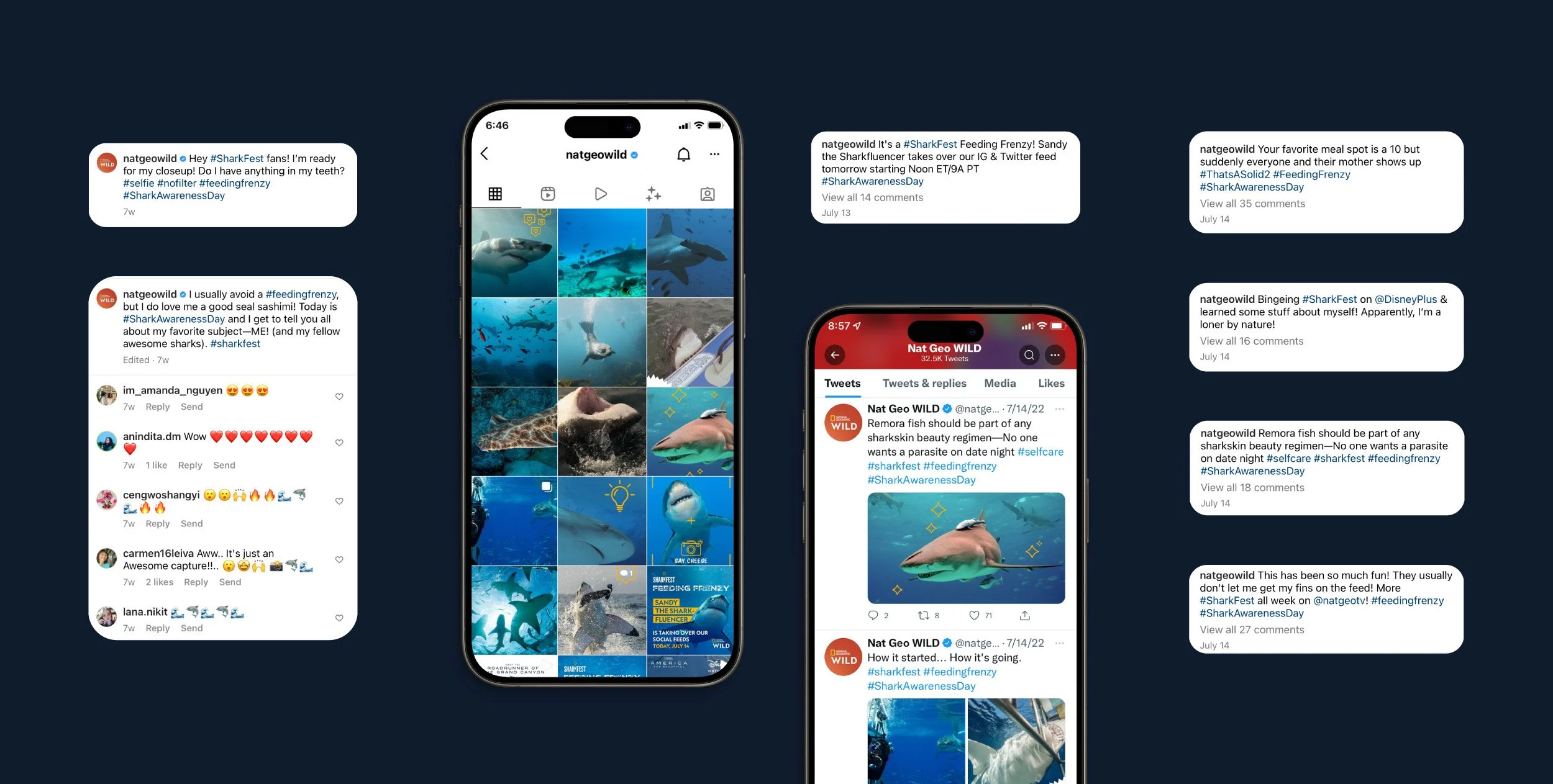
Designing for a character-led takeover across two platforms simultaneously added another layer of complexity. Instagram and X have distinct visual grammars, and every graphic had to feel at home on both while maintaining a consistent identity across 14 scheduled posts throughout the day.
THE STRATEGIC APPROACH
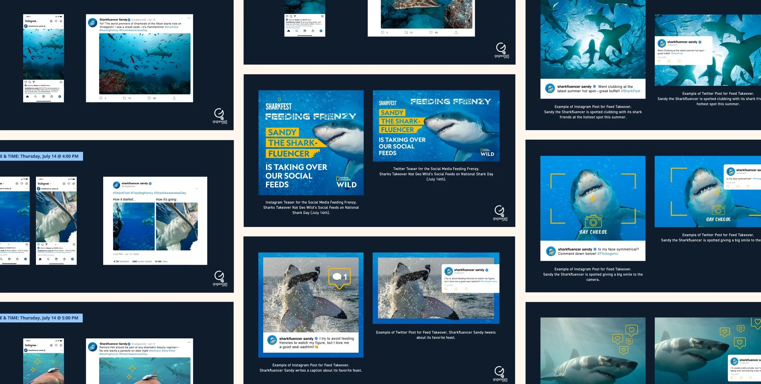
The concept began with a clear creative proposition: rather than broadcasting about sharks, what if a shark did the broadcasting? Sandy the Sharkfluencer was the answer, a persona built to deliver shark facts and SharkFest content with humor and personality, framed as a social media takeover in the spirit of a celebrity Instagram account. As the lead graphic designer, she worked closely with the creative team to structure the day in two phases: a teaser to build anticipation before Sandy's debut, followed by a full day of scheduled content, turning the takeover into a moment rather than just a series of posts.
With the concept greenlit, she developed a single refined style frame to establish the visual direction before any content was produced. Bringing one fully considered direction to the NatGeo team rather than multiple routes was a deliberate choice, ensuring they could see exactly how the campaign would look and feel in practice before committing to the full execution.
THE DESIGN PROCESS
With the concept and strategy in place, she led the design of a complete visual system to bring Sandy to life across both platforms. Using NatGeo Wild’s brand guidelines as a foundation, she developed a distinct campaign personality within that framework, balancing the integrity of a globally recognized media brand with a direction that felt unexpected, and genuinely fun.
The teaser graphics were designed first to build intrigue without revealing the full concept, staying rooted in the brand’s visual language. This evolved into a full suite of 14 posts, each carefully curated through the interplay of photography, typography, and graphic elements to express Sandy’s personality while maintaining consistency. Color, imagery, and type were considered holistically so the campaign felt cohesive across Instagram and X. Copywriting for captions was developed alongside the visuals, allowing Sandy’s voice to emerge in sync, striking a precise balance between humor and editorial credibility in every post.
THE OUTCOME
The campaign delivered a fully realized social media takeover that felt both distinctive and true to NatGeo Wild’s brand identity. Sandy the Sharkfluencer gave SharkFest a personality beyond traditional promotion, turning International Shark Day into a real-time, follow-worthy event, with strong engagement signaling that the character-led concept resonated with the audience. It ultimately demonstrated the impact of building strategy, design, and copy together from the start, and what’s possible when a brand shows up differently.
A 14-post social media takeover campaign executed across Instagram and X.
The posts generated strong engagement across both platforms.