A full UI/UX redesign crafted to give a marketing agency the presence it had earned.
Gigawatt Group is a creative marketing agency defined by bold ideas and strategic vision, but their website had stopped reflecting that. What the brand stood for in the room wasn't coming through online. She took on the full UI/UX redesign to close that gap: bringing the agency's digital presence into alignment with the quality and ambition of the work behind it.
OVERVIEW
STACK
Figma
FigJam
Wordpress
Illustrator
Photoshop
Procreate
CLIENT
Gigawatt Group
INDUSTRY
Digital Marketing & Creative Media
CREDITS
UI/UX Web Design · Digital Illustration → Yasmine Bouchlaghem
Marketing & Creative Direction → Jim McNulty
Marketing Strategy → Orlando Trott
SERVICES
Web Design
UI/UX
Digital Illustration
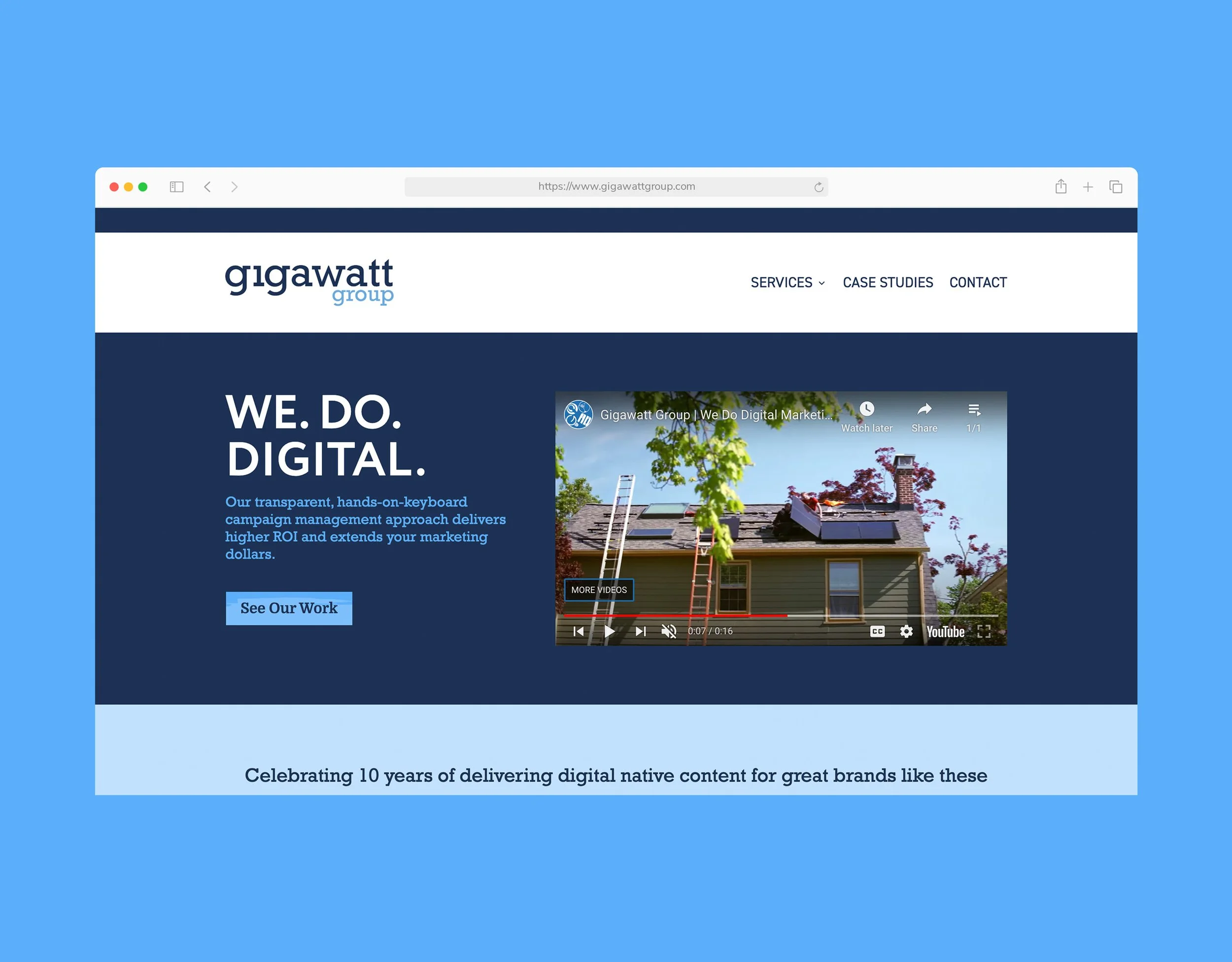
Gigawatt Group's existing website no longer reflected the agency's level of craft, with a visual language and structure that felt misaligned with its evolving identity. But beyond aesthetics, the core issue was perception. For a creative agency, the website is the work, and this one wasn't fully expressing the depth of its capabilities.
The redesign needed to go beyond a visual update. It had to establish trust at first glance, communicate capability with clarity, and express a distinct point of view. The goal was to create an experience that felt unmistakably Gigawatt Group, setting it apart in a space where many agency sites begin to feel interchangeable. The scope was deliberately calibrated as a brand refresh rather than a full rebrand: preserving what was working while elevating everything that wasn't.
THE CHALLENGE
THE STRATEGIC APPROACH
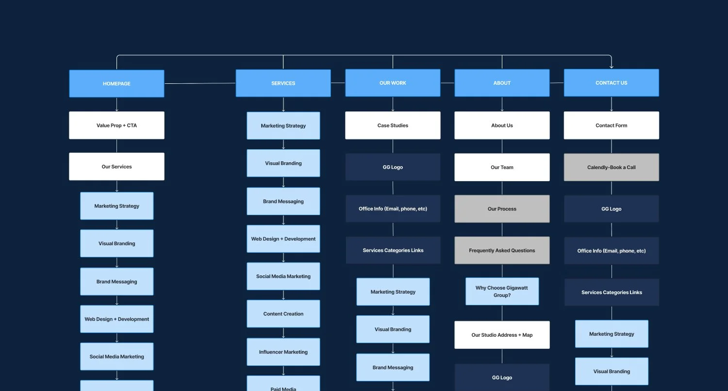
In close collaboration with the Creative Director and Sr. Marketing Strategist, the team began with a series of strategic working sessions to align on positioning, audience, and messaging priorities, establishing a clear direction for how the brand should be experienced online. Building on that foundation, a comprehensive site map was developed to define not just where content lived, but the role each section played within the broader brand narrative.
Every page was approached through two lenses simultaneously: what the user needed to understand, and what the business aimed to communicate. That dual framework became the foundation for all decisions that followed, ensuring the redesign would be as purposeful as it was considered.
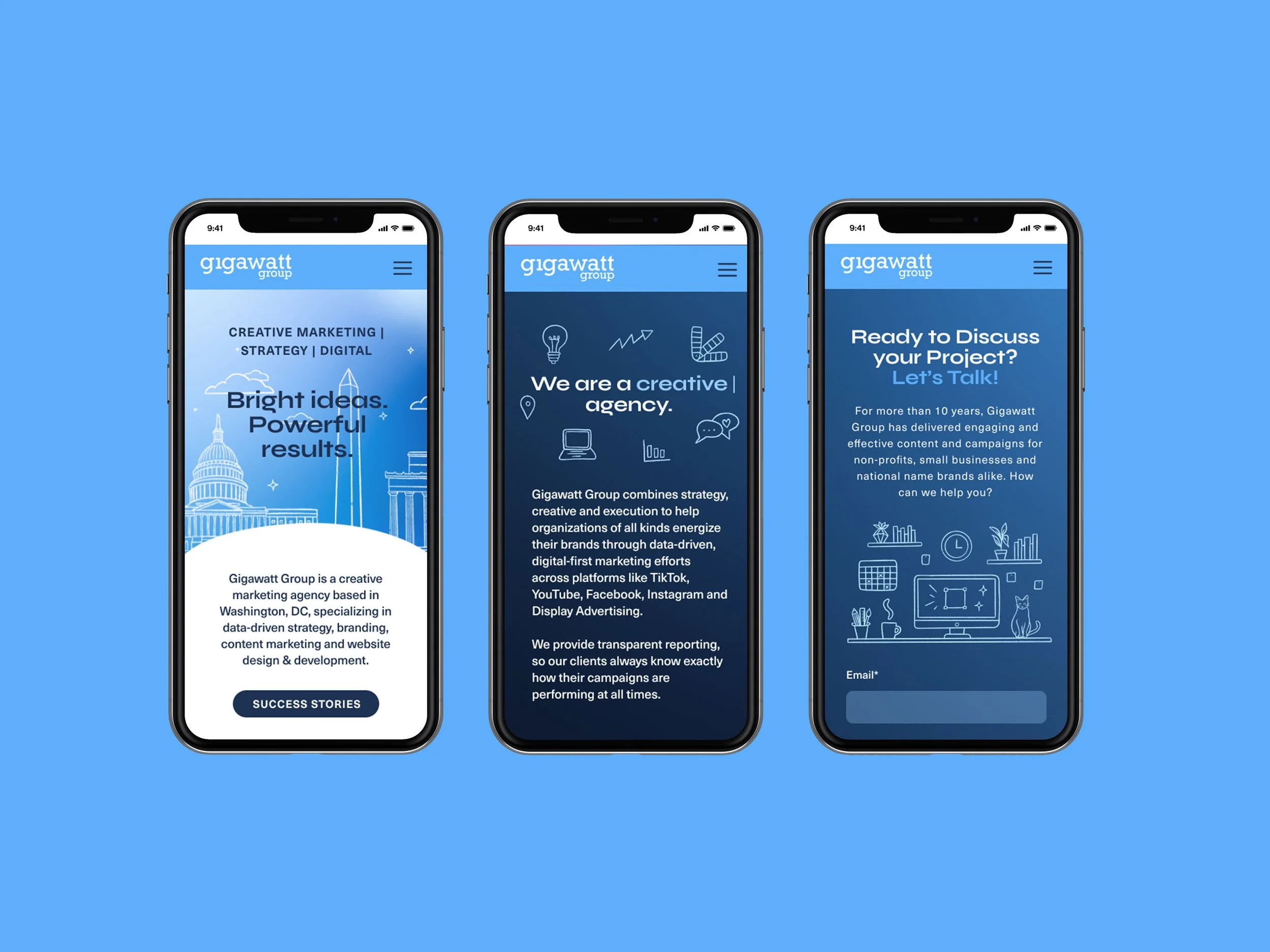
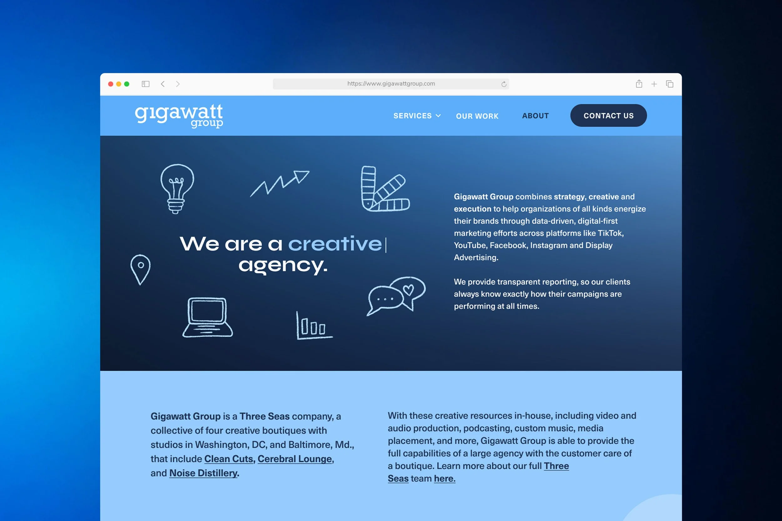
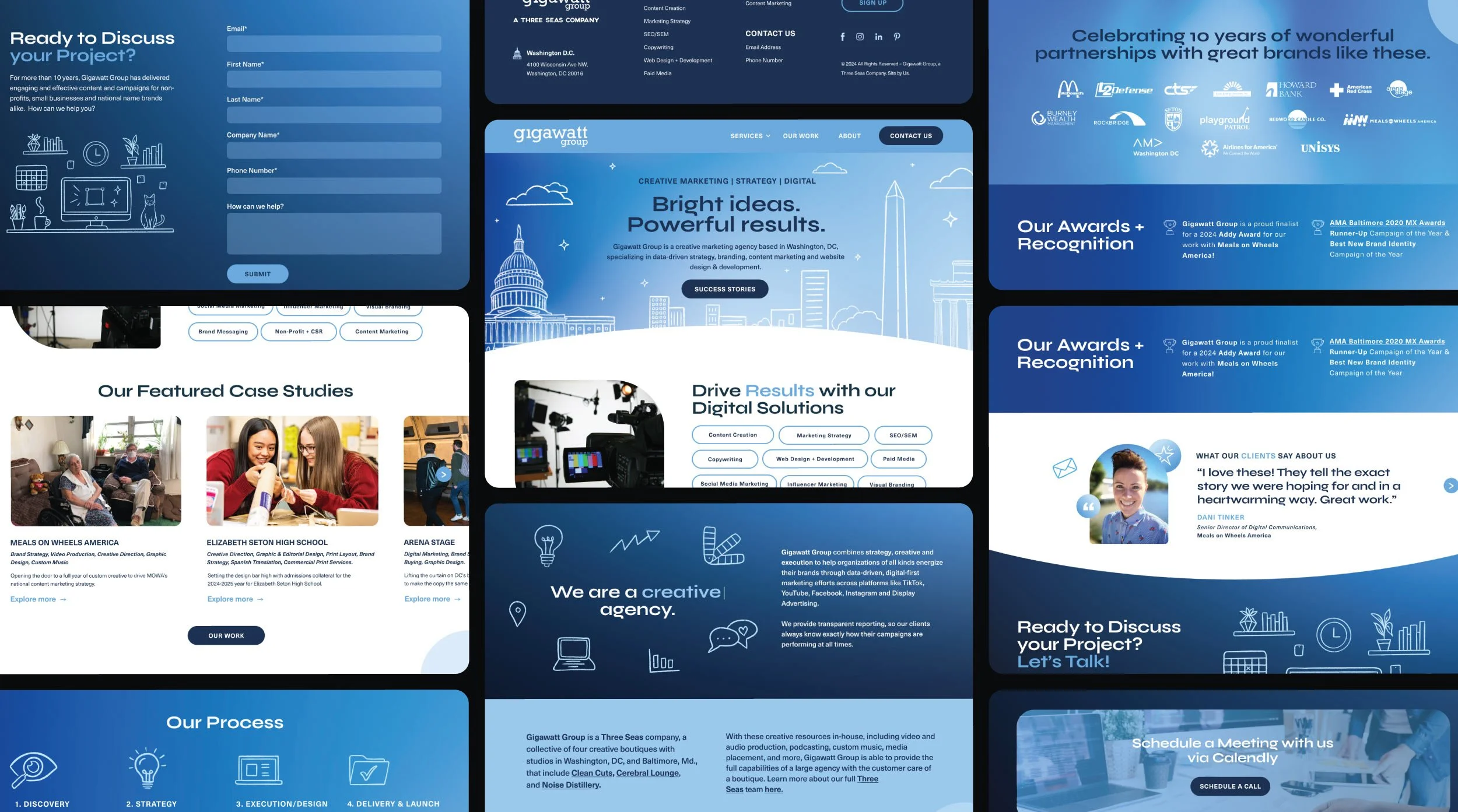
She also created a full suite of custom illustrations and iconography, giving the brand a distinct visual vocabulary that extended well beyond what any template or stock asset could offer. These elements were woven into the layouts to support storytelling at every level of the page, transforming the experience from something passively scrolled to something personal and genuinely felt.
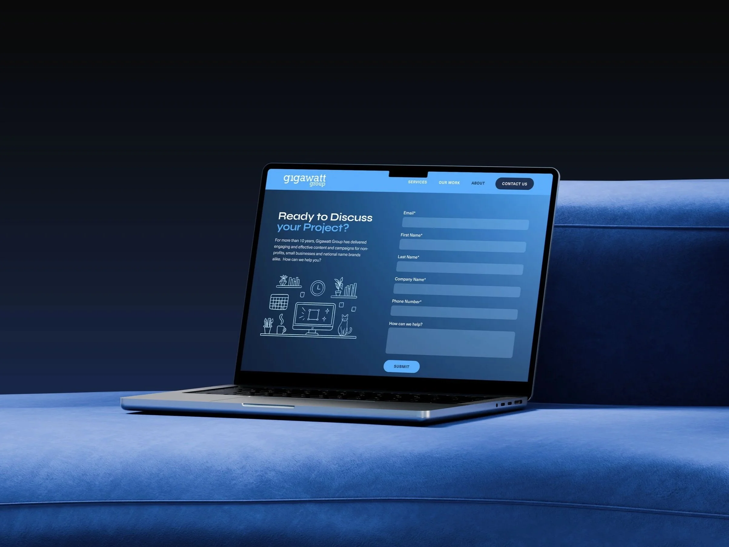
Rather than retrofitting layouts for smaller screens at the end, every design decision was made with the full range of devices in mind from the outset so the experience felt considered and adaptable at every size.
Throughout the process, iterative reviews with the Creative Director and Sr. Digital Strategist kept the work anchored. The strongest design outcomes rarely come from working in isolation, and this project was no exception. Collaboration brought sharper questions, better answers, and ultimately, a site where nothing was arbitrary and everything earned its place.
THE DESIGN PROCESS
With a clear strategic foundation in place, she moved into layout design, starting with wireframes focused on hierarchy, flow, and compositional clarity before introducing any visual treatment. The discipline of this stage was intentional: when structure is resolved first, every stylistic decision that follows has something solid to support.
Once the architecture held, she developed the visual language by presenting style frames. Typography was selected with care, with intentional font choices that modernized the brand's voice without erasing its foundation. A custom gradient system was built as a considered design tool, with each gradient calibrated to the emotional tone of its surrounding content, adding depth and movement without overwhelming the integrity of the layout.

THE OUTCOME
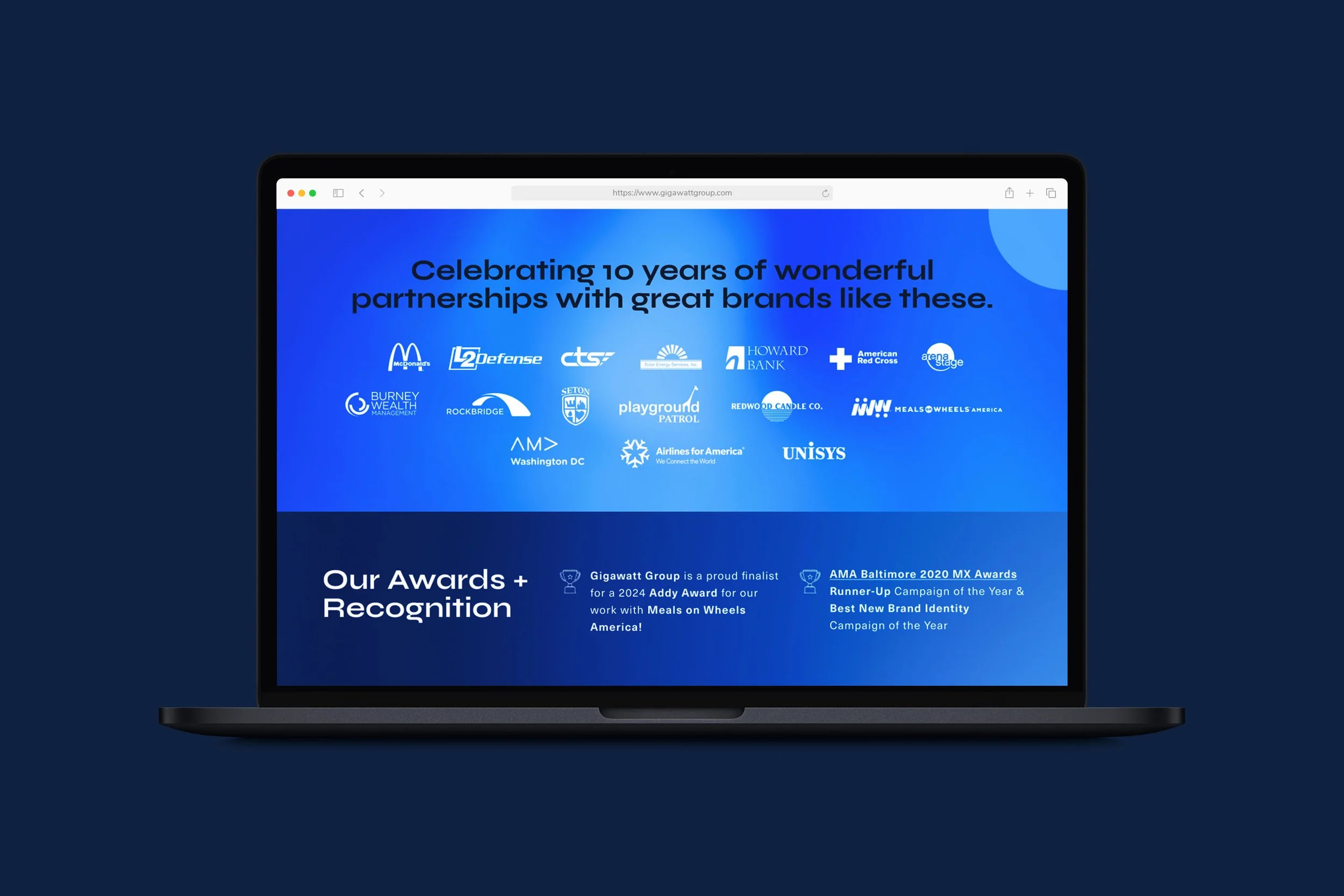
The relaunched Gigawatt Group website brought their digital presence into full alignment with their creative identity. Clearer navigation reduced friction for new visitors. The refined visual design, built on a cohesive system of custom gradients, hand-drawn illustrations, and typography, positioned the agency as a thoughtful, credible, and distinctly modern creative partner that stood apart in a saturated market.
The result was more than a visual refresh. It was a platform built with intention, where every interaction was considered to create a seamless user journey across devices, balancing clarity, performance, and responsiveness to ensure the experience felt as effortless as it was engaging.
Developed a scalable library of custom illustrations, applied consistently across the website.
Built a custom gradient system with distinct expressions tailored to different sections of the site.