An admissions redesign built to set Elizabeth Seton High School apart.
Elizabeth Seton High School has a strong identity and a clear mission, but their admissions materials weren't fully reflecting either. For a school competing for the attention of prospective students and their families, first impressions matter. This project was an opportunity to bring a bold, modern design direction to their printed collateral, creating a cohesive visual system that felt true to the school's values while resonating with a contemporary audience.
OVERVIEW
STACK
Photoshop
Illustrator
InDesign
CLIENT
Elizabeth Seton High School
CREDITS
↓ Yasmine Bouchlaghem
Graphic Design · Marketing Collateral Design · Print Production Design · Editorial Design · Photoshoot Art Direction · Project Management
INDUSTRY
Education
SERVICES
Marketing Collateral Design
Print Design
Editorial Design
Photoshoot Art Direction
Graphic Design
Admissions materials carry a specific kind of weight. They are often the first tangible touchpoint between a school and a prospective family, and they need to communicate credibility, warmth, and ambition all at once. For Elizabeth Seton, the challenge was introducing a bold new visual direction that felt like a meaningful evolution rather than a departure from who they are.
The scope added another layer of complexity. The new design system needed to extend cohesively across a wide range of printed deliverables, from a 32-page bilingual lookbook to smaller format stationery pieces, while maintaining visual consistency across every touchpoint.
THE CHALLENGE
THE STRATEGIC APPROACH
The project began with an in-person meeting at the school, bringing together the creative director and Seton's marketing team to align on expectations, priorities, and creative direction before any design work began. That conversation was foundational: understanding the school's identity, their audience, and what they felt was missing from their existing materials ensured that every design decision that followed had clear purpose and direction.
From there, the focus was on developing a design direction that could serve two distinct audiences at once: prospective students drawn to something bold and visually engaging, and their parents looking for signals of credibility and institutional strength. Striking that balance between modern confidence and academic seriousness became the creative brief that shaped everything that followed.
THE DESIGN PROCESS
Working under the creative director, she developed a range of style frames, each presenting a distinct visual interpretation of the brief, so the marketing team could make an informed and considered creative decision.
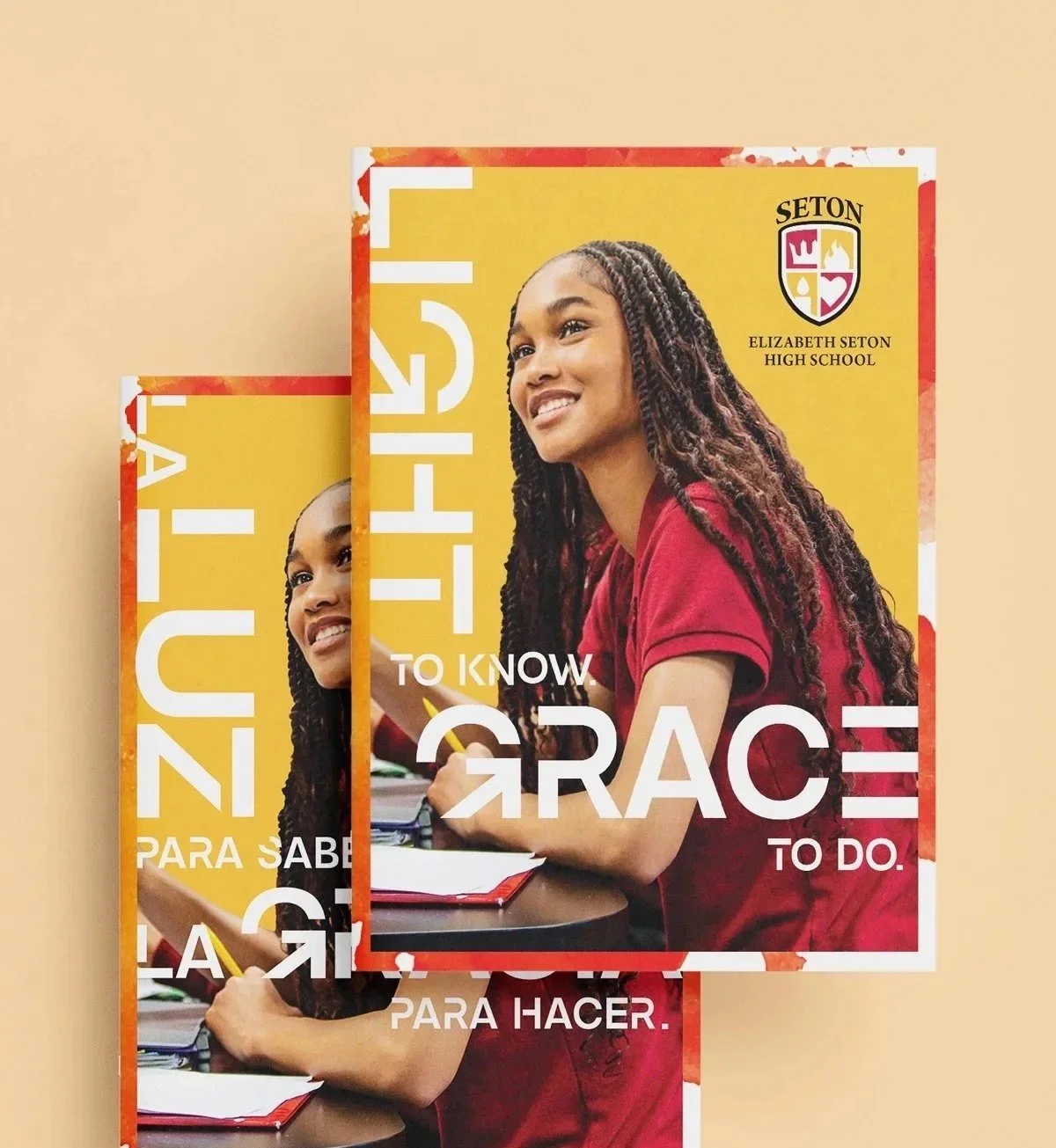
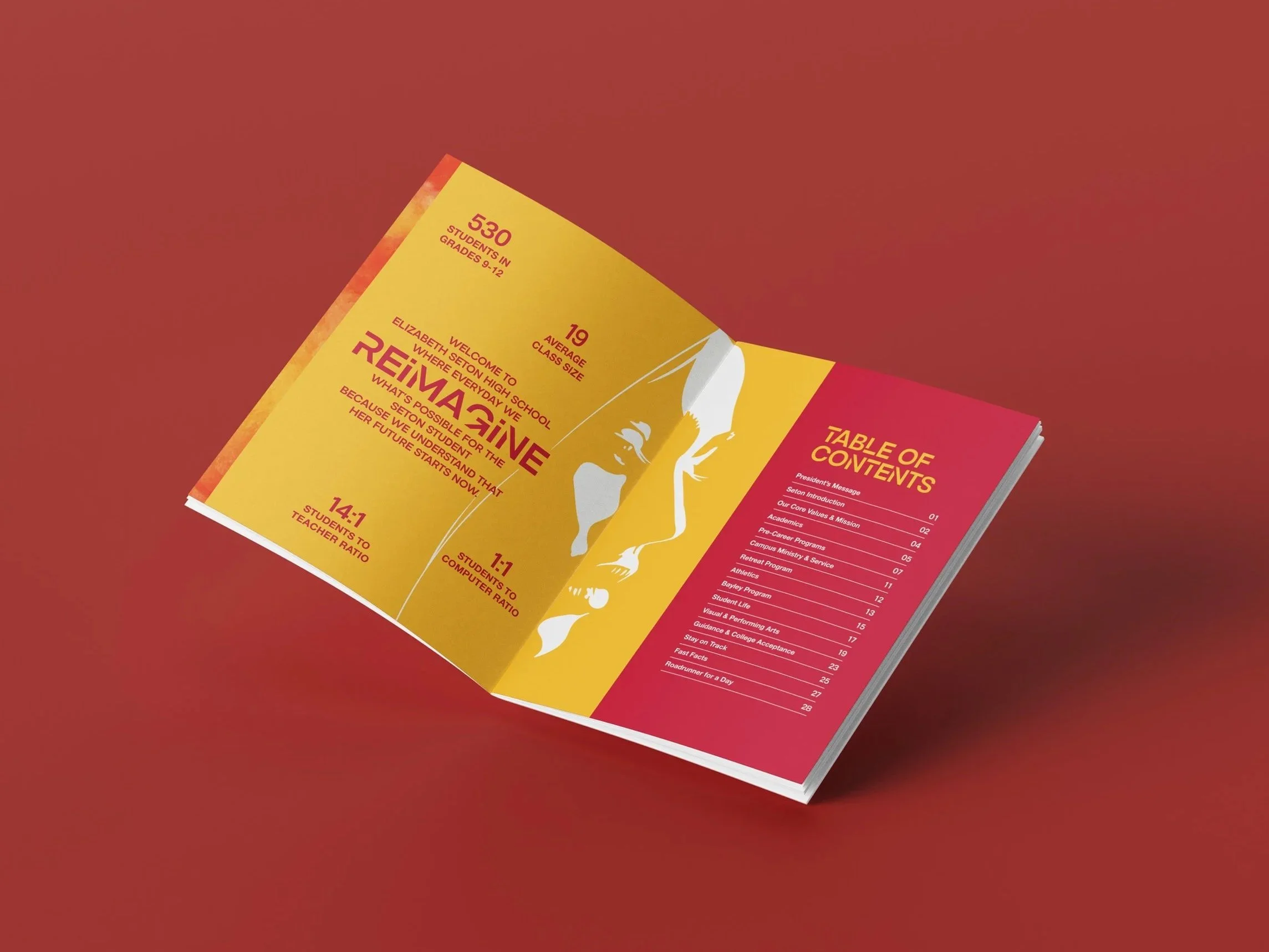
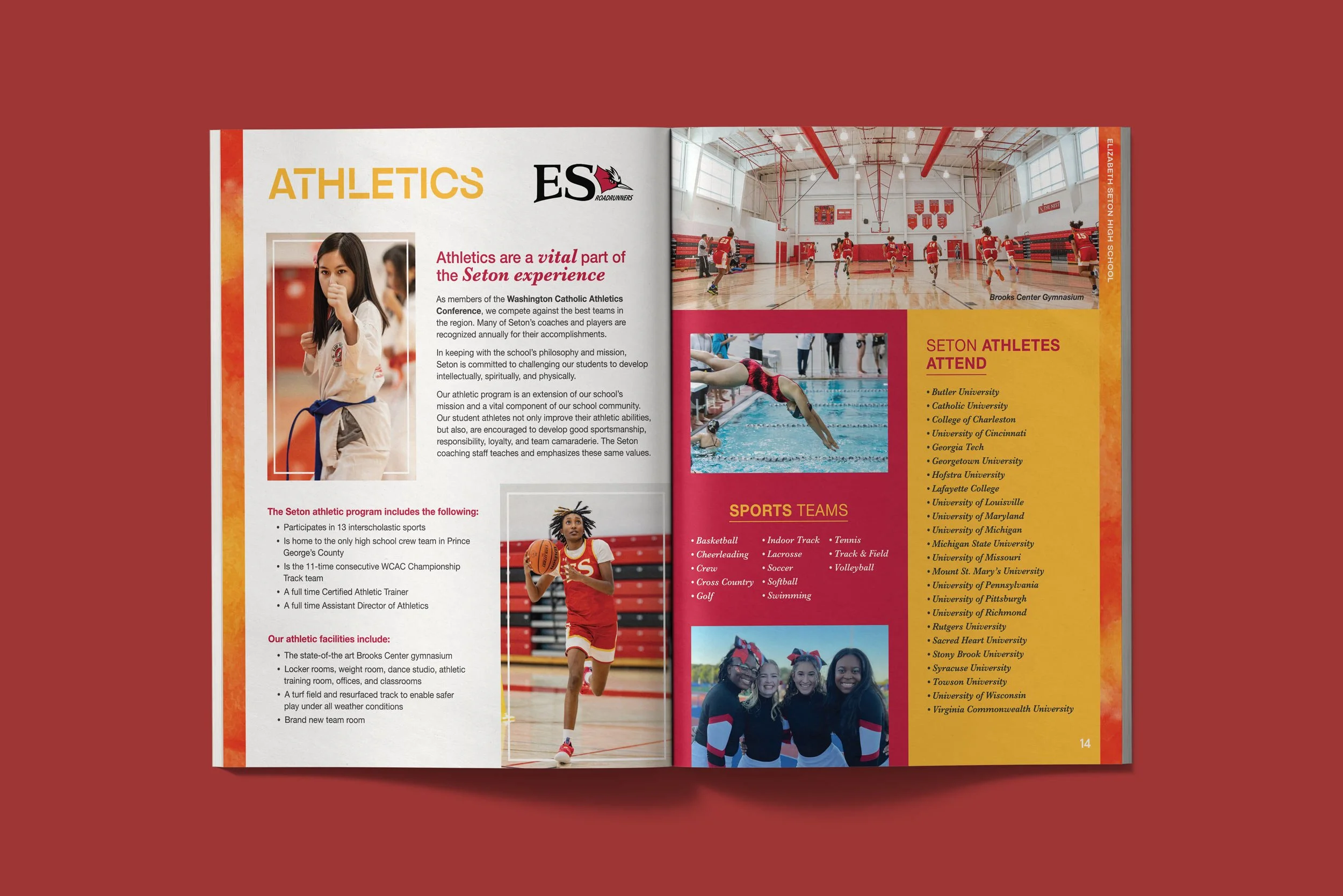
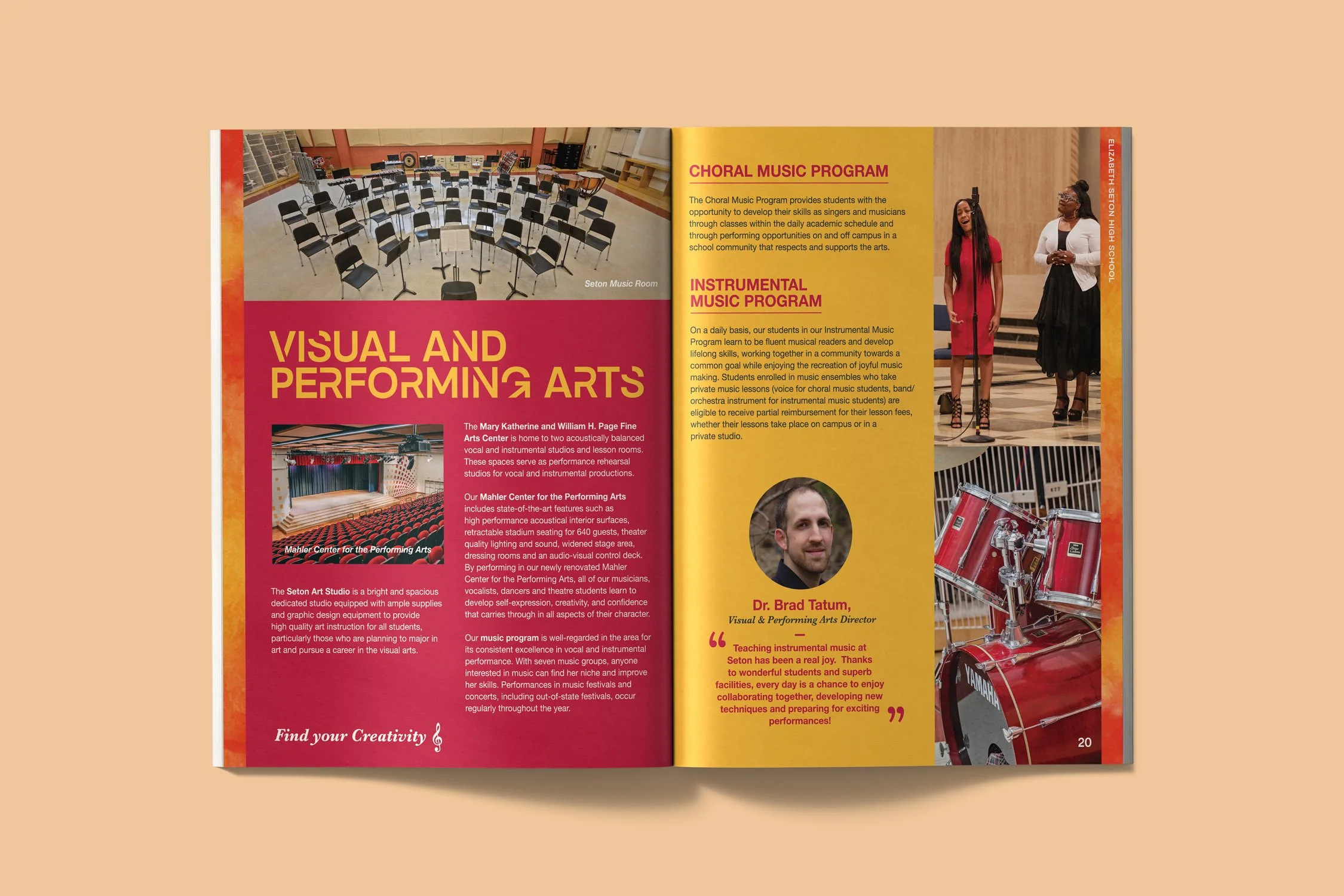
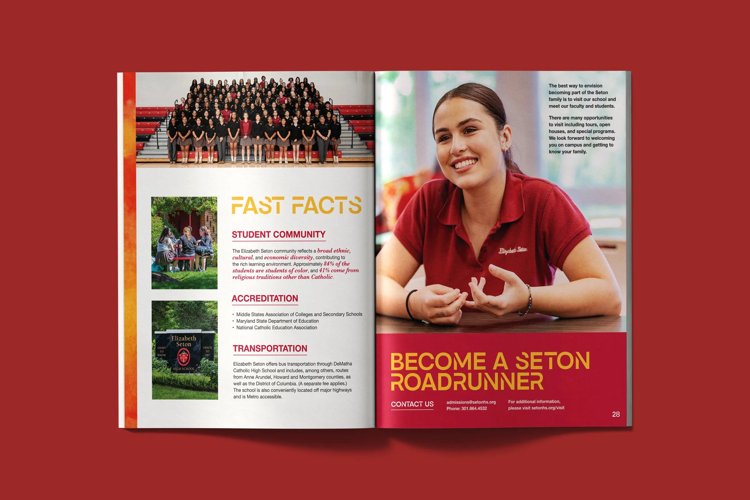
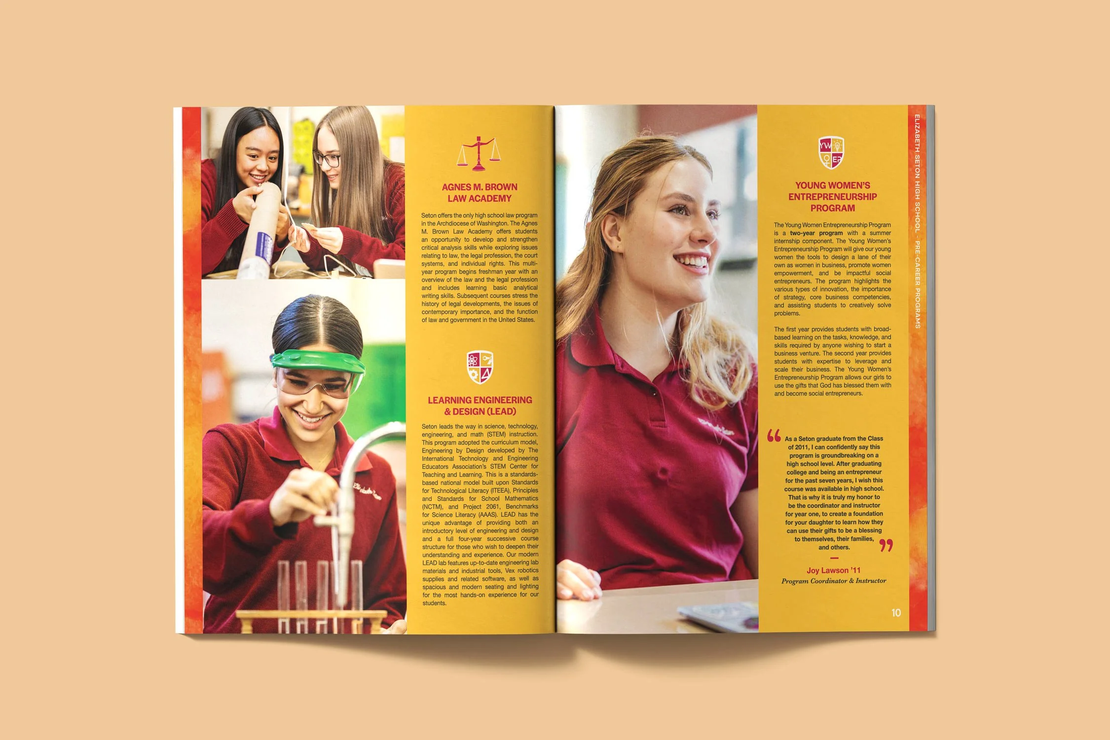
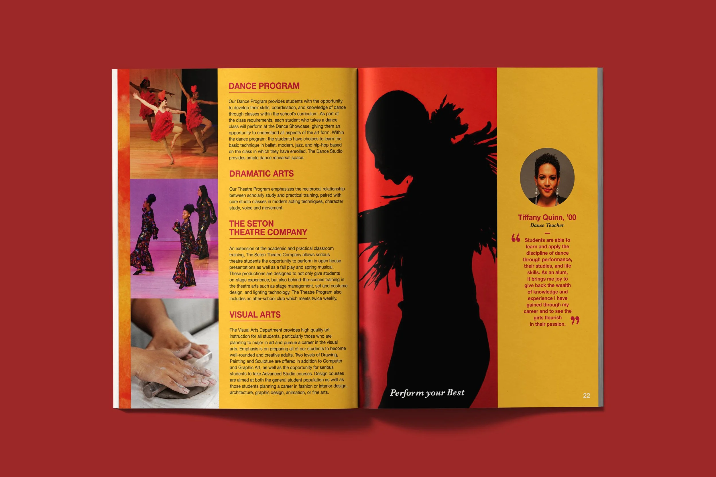
Once a direction was selected, she took full ownership of the project, leading print production and managing the design process end to end. The 32-page lookbook, produced in both English and Spanish, served as the anchor. Bold typography, full-bleed photography, and vivid color-blocked layouts came together to create spreads that felt energetic and editorial without losing institutional clarity. That visual language carried consistently through every chapter, with color, type, texture, and image placement used to guide the reader through the publication with confidence.
Art directing the photoshoot ensured the imagery was captured with the layouts already in mind, so photography and design worked together rather than around each other.
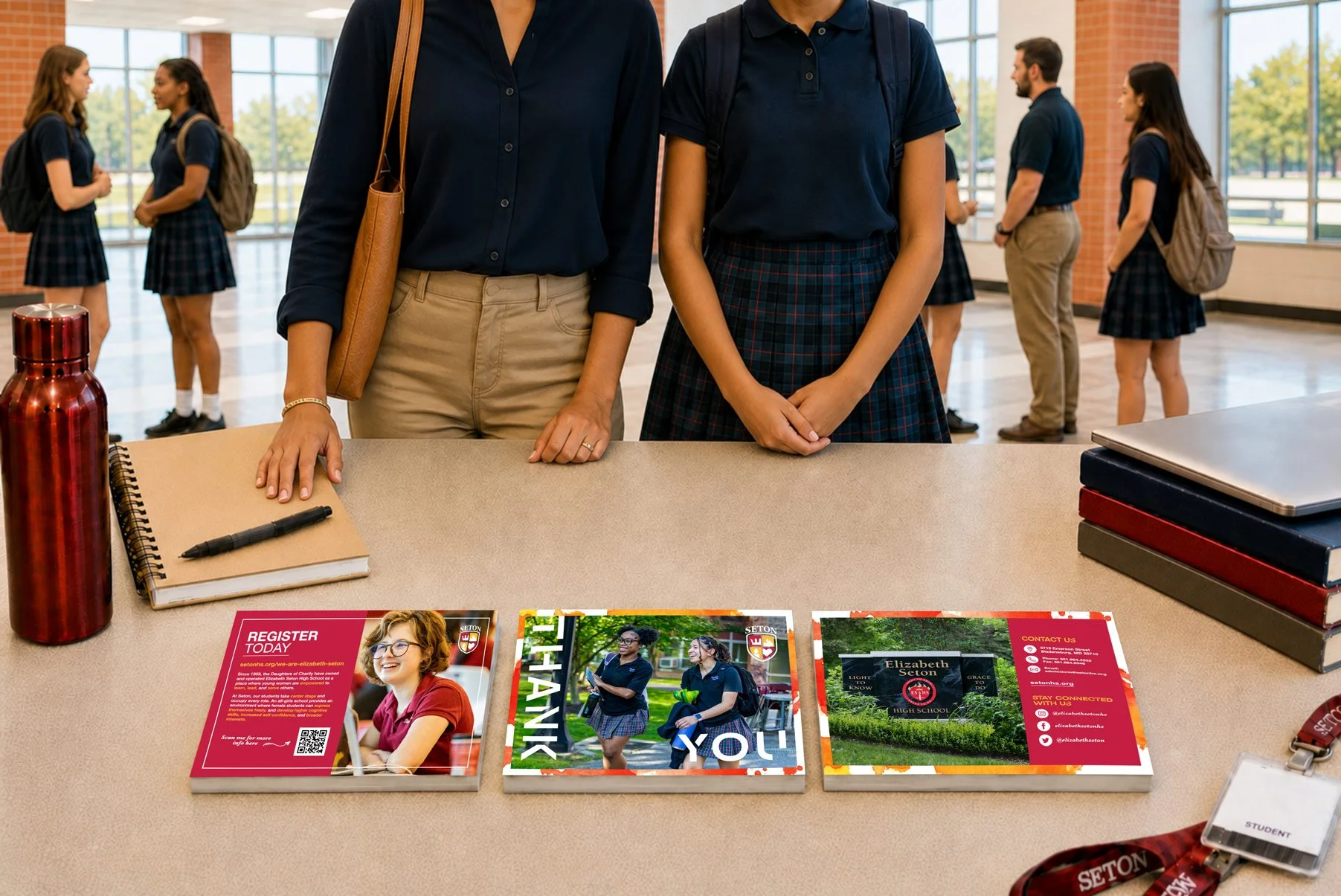
The thank you card and postcard extended the bold typographic language into smaller formats, each designed to feel like a natural extension of the lookbook while standing on their own as individual pieces a prospective family would hold in their hands.
THE OUTCOME
The completed suite gave Elizabeth Seton High School a unified visual presence across every printed touchpoint of their recruitment cycle. The bold, modern design direction resonated with prospective students while giving parents the sense of credibility and care they look for in a school's communication.
Producing the lookbook in both English and Spanish ensured the materials were inclusive and accessible to the school's full community, with layouts carefully adapted so both versions held the same visual weight and page count. Every piece worked together as a system, establishing a design foundation the school could build on in future academic years.
A 32-page bilingual lookbook and supporting collateral spanning 6 deliverables
Lookbook delivered in print and as an interactive website PDF
In the Client’s Words
« The final deliverables look so good!!!
We cannot wait to show our staff, students, and parents the new admission materials. Thank you! »
STEPHANIE AYALA
Marketing & Communications Specialist
Elizabeth Seton High School