A printed monograph exploring Didot's history, cultural influence, and enduring relevance.
Few typefaces have shaped visual culture as quietly and completely as Didot, yet its story is rarely told in full. This monograph set out to change that, treating the typeface as a cultural artifact with a legacy that spans centuries and continents.
OVERVIEW
STACK
Illustrator
Photoshop
InDesign
AUTHORED BY
Yasmine Bouchlaghem
CREDITS
↓ Yasmine Bouchlaghem
Art Direction · Editorial Design · Print Design · Photography · Research · Copywriting · Project Management
INDUSTRY
Publishing & Editorial Design
SERVICES
· Art Direction
· Editorial Design
· Print Design
· Photography
· Research & Copywriting
THE CHALLENGE
Didot is a typeface most people recognize without knowing why. Its elegance feels instinctive, and its authority almost inevitable, which makes it both fascinating and genuinely difficult to write about with the depth it deserves.
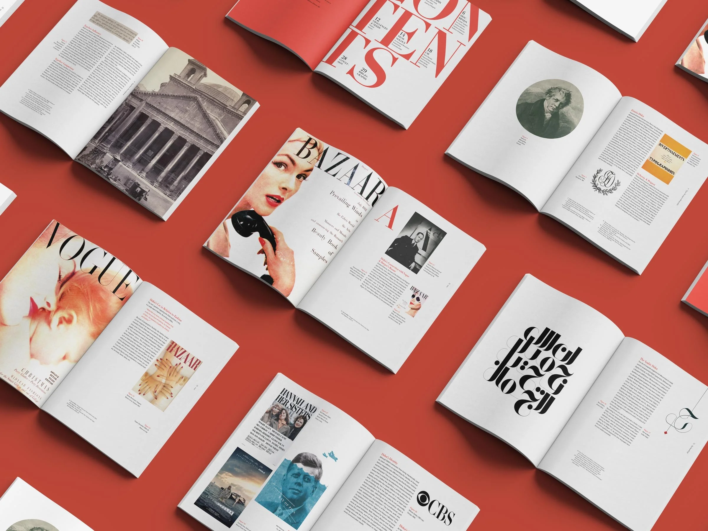
The challenge was to create a publication that could hold its own intellectually and visually: one that traced the typeface's origins in eighteenth-century France, examined its relationship to technology and globalization, and made a case for its continued relevance in contemporary design.
The design itself posed an equal challenge. A monograph about a typeface has to demonstrate mastery of the very subject it discusses. Every layout decision, typographic choice, and photograph was part of the argument.
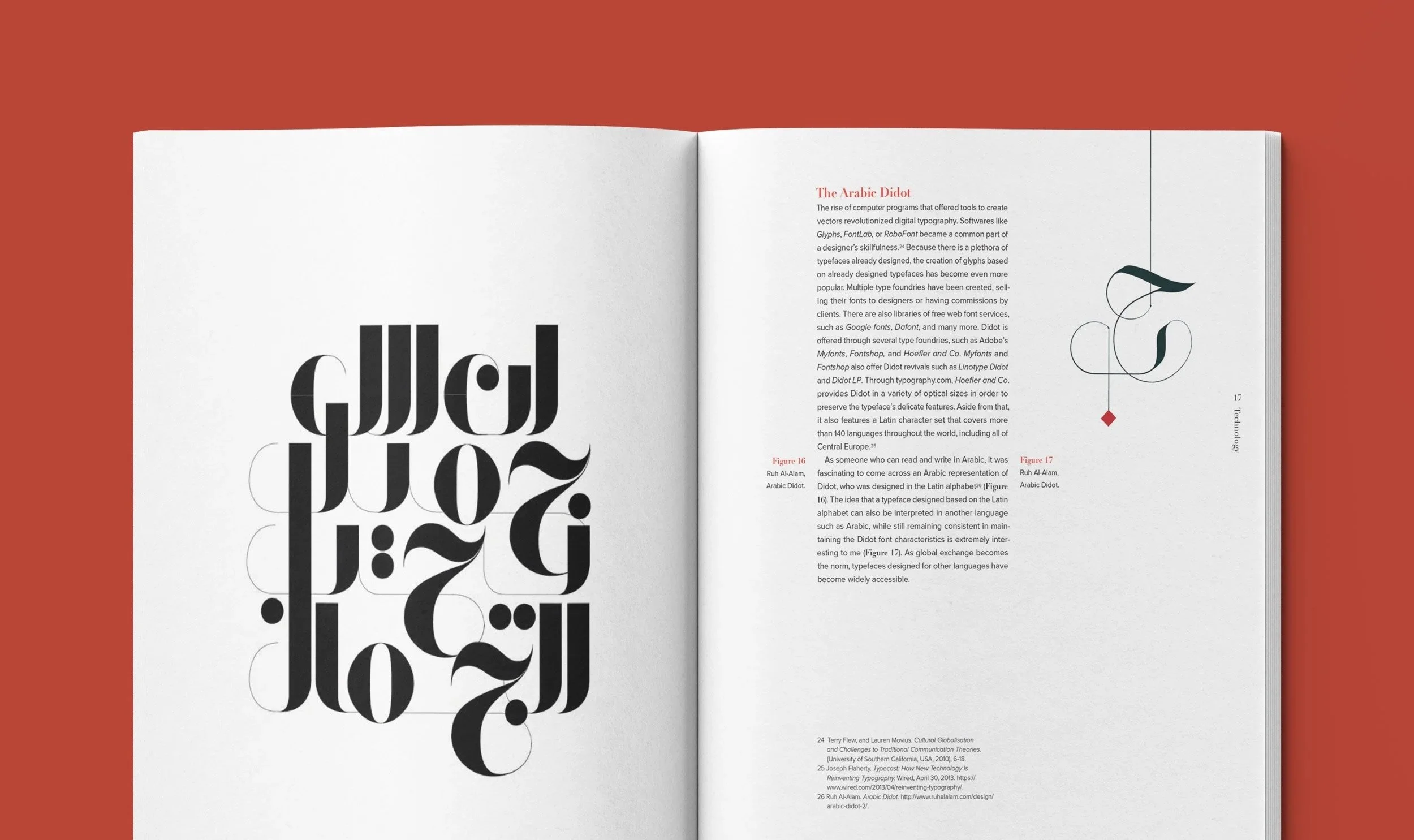
THE STRATEGIC APPROACH
Before a single layout was touched, she immersed herself in research. Drawing from books, scholarly articles, and archival sources, she built a deep understanding of Didot's origins, its technical evolution, and its lasting presence in fashion, branding, and visual culture. That research shaped every design decision that followed.
As designer, author, art director, and photographer, every dimension of the project was hers to define. The throughline across all of it was consistency: representing Didot's personality: elegant, precise, and quietly commanding across every page, so the publication felt cohesive and curated from start to finish.
THE DESIGN PROCESS
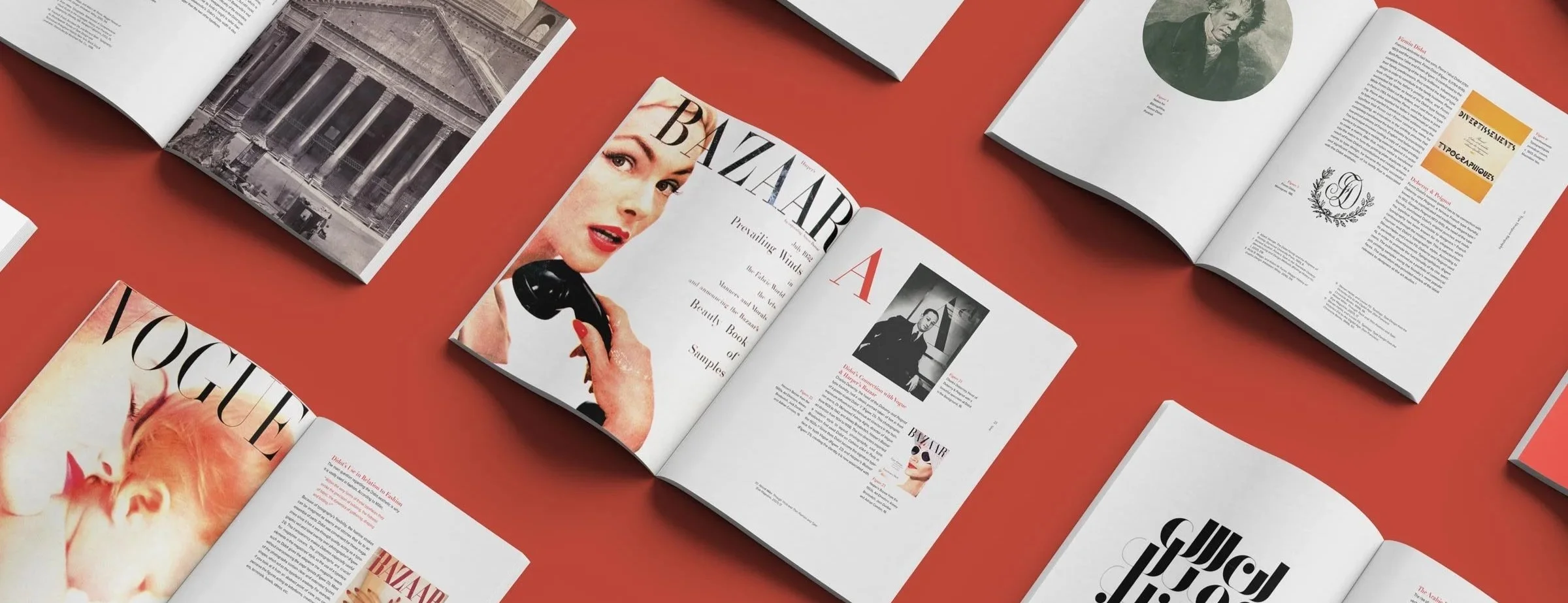
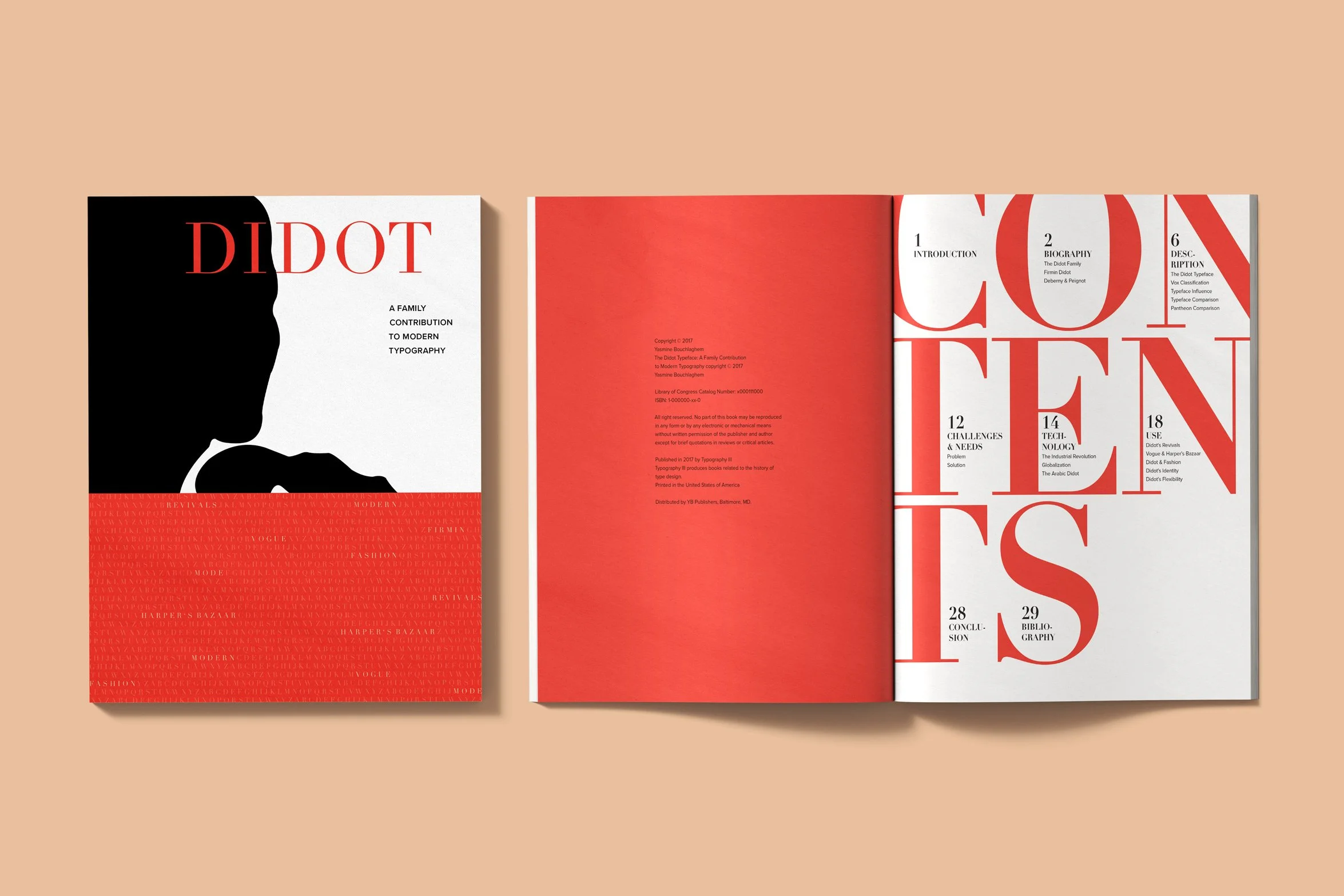
She approached the layouts with both discipline and intention. A strict grid system governed every spread, while a restrained palette of black, white, and red gave the monograph a visual identity that felt contemporary without competing with the historical material it contained.
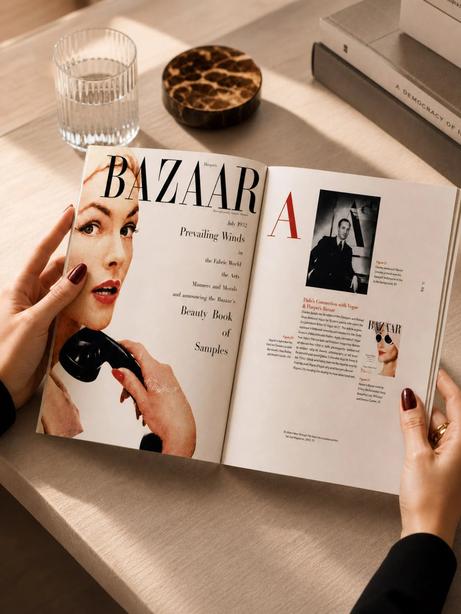
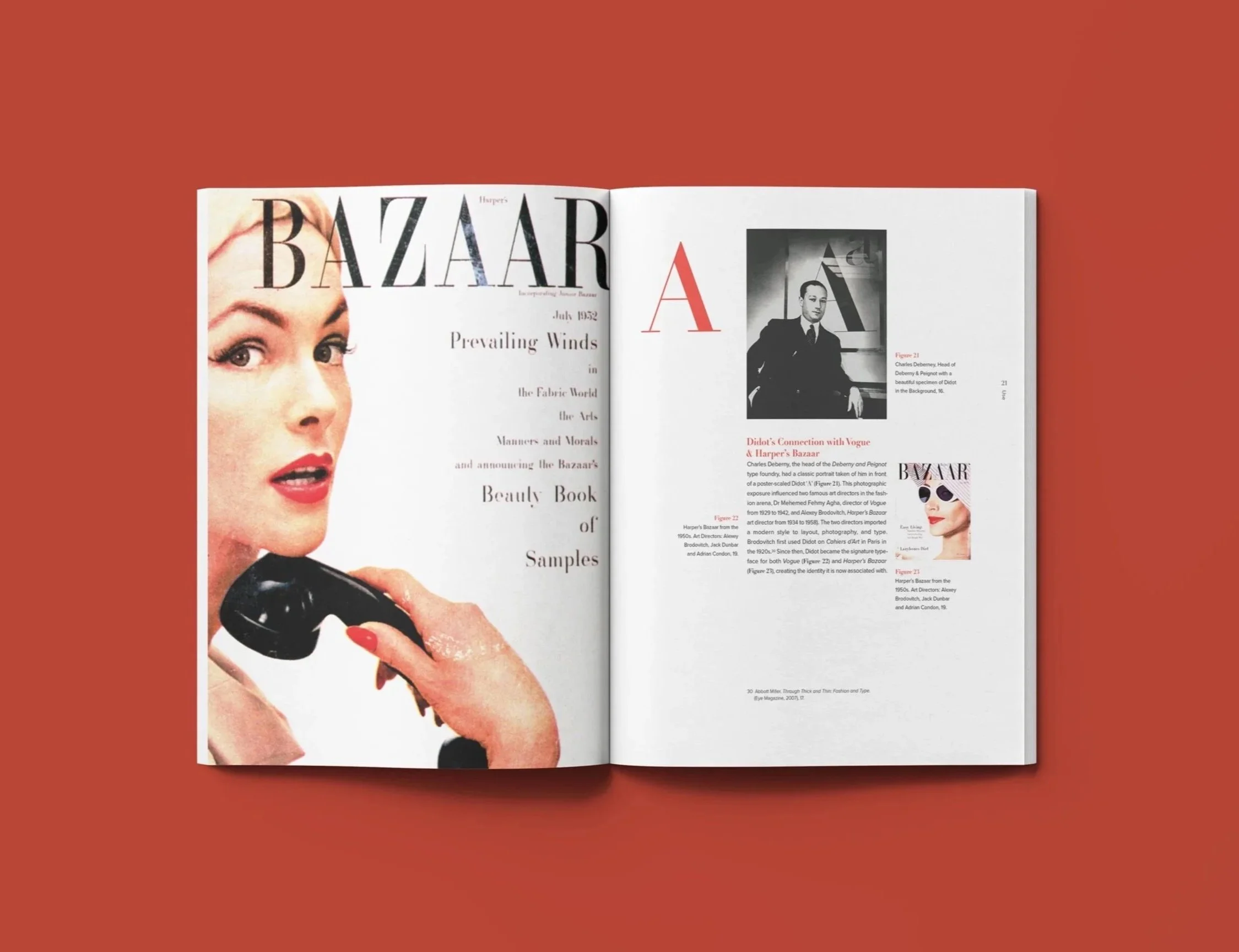
With Didot as both subject and medium, every typographic decision carried double the responsibility, organizing the reader's eye while demonstrating the typeface's range and character. Whether documenting its eighteenth-century origins or its presence in Vogue and Harper's Bazaar, every spread was designed to embody Didot's personality: refined, elegant, and precise in equal measure.
THE OUTCOME
Leading the project as art director, designer, copywriter, photographer, and project manager, she brought the monograph to life entirely on her own terms.
The result is a thoroughly researched and visually considered printed publication that traces Didot from its origins in the age of Enlightenment, through its cross-cultural adaptations, to its continued presence across fashion, film, and branding today.
More than a research exercise, it is a demonstration of what print editorial design can achieve when concept, content, and craft are held to the same standard.
A high-resolution printed monograph produced to professional publication standards.
A typeface with cross-cultural reach spanning over 140 languages worldwide.