A full-scale spring digital advertising campaign crafted to boost travel to Washington DC.
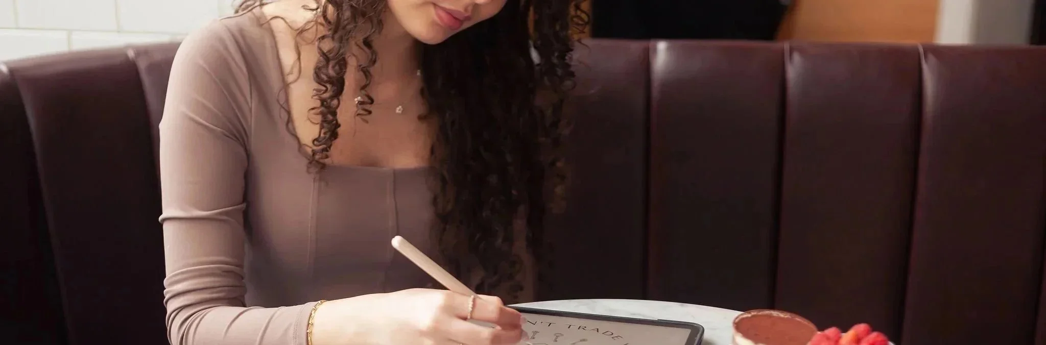
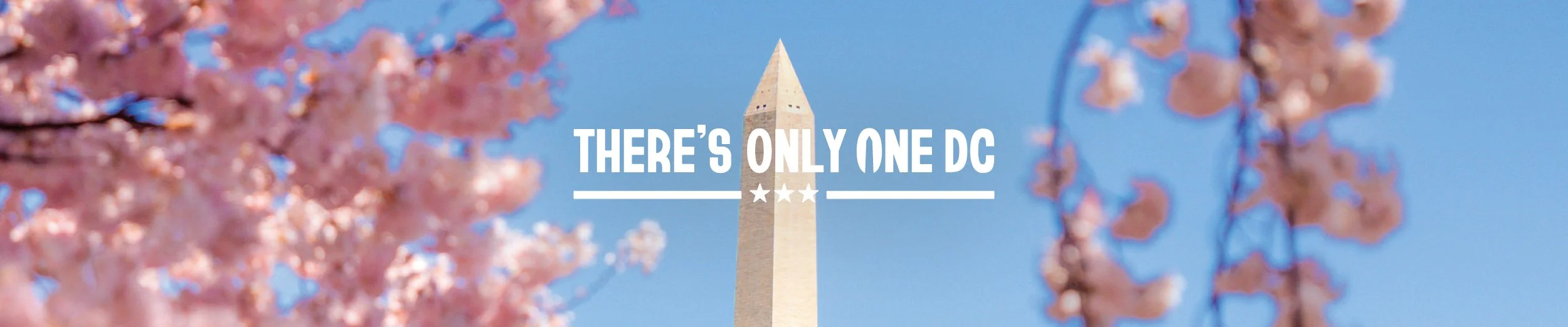
Destination DC's "There's Only One DC" campaign is a celebration of everything that makes the nation's capital unlike anywhere else. For the spring season, the goal was to reach the right people with the right message across a wide range of digital touchpoints, from website banner ads to Spotify and Instagram stories. As lead designer on the project, she was responsible for designing and delivering the full suite of spring display advertisements, collaborating closely with the project manager, two creative directors, the marketing team, and receiving final approval from the Chief Marketing Officer.
OVERVIEW
STACK
Illustrator
Photoshop
Creatopy
CLIENT
Destination DC
CREDITS
Website Banner Display Static Ads · Website Banner Display HTML5 Ads · Spotify Static Ad Designs · Meta Vertical Stories Design → Yasmine Bouchlaghem
Creative Direction → Alex Gnafakis & J’Nay Penn
Project Management → Gina Hopkins
INDUSTRY
Tourism
SERVICES
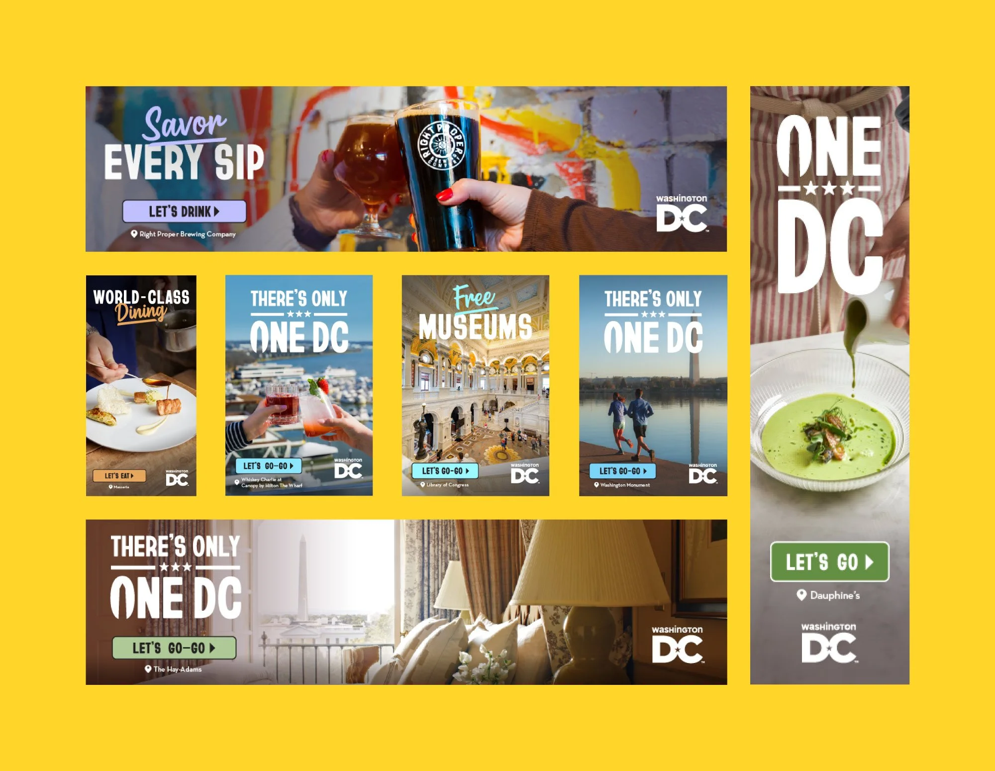
· Website Banner Display Static Ads
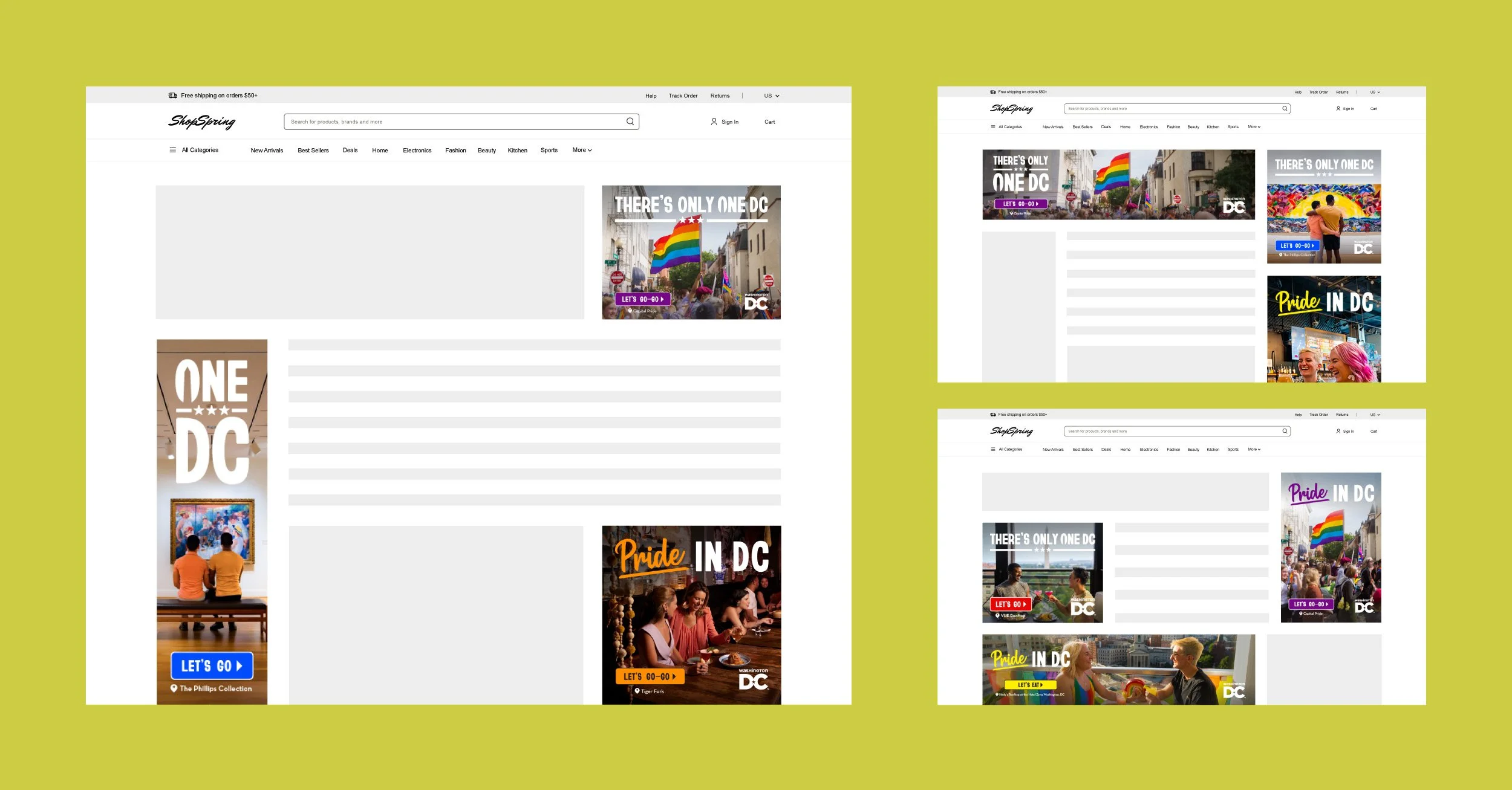
· Website Banner Display HTML5 Ads
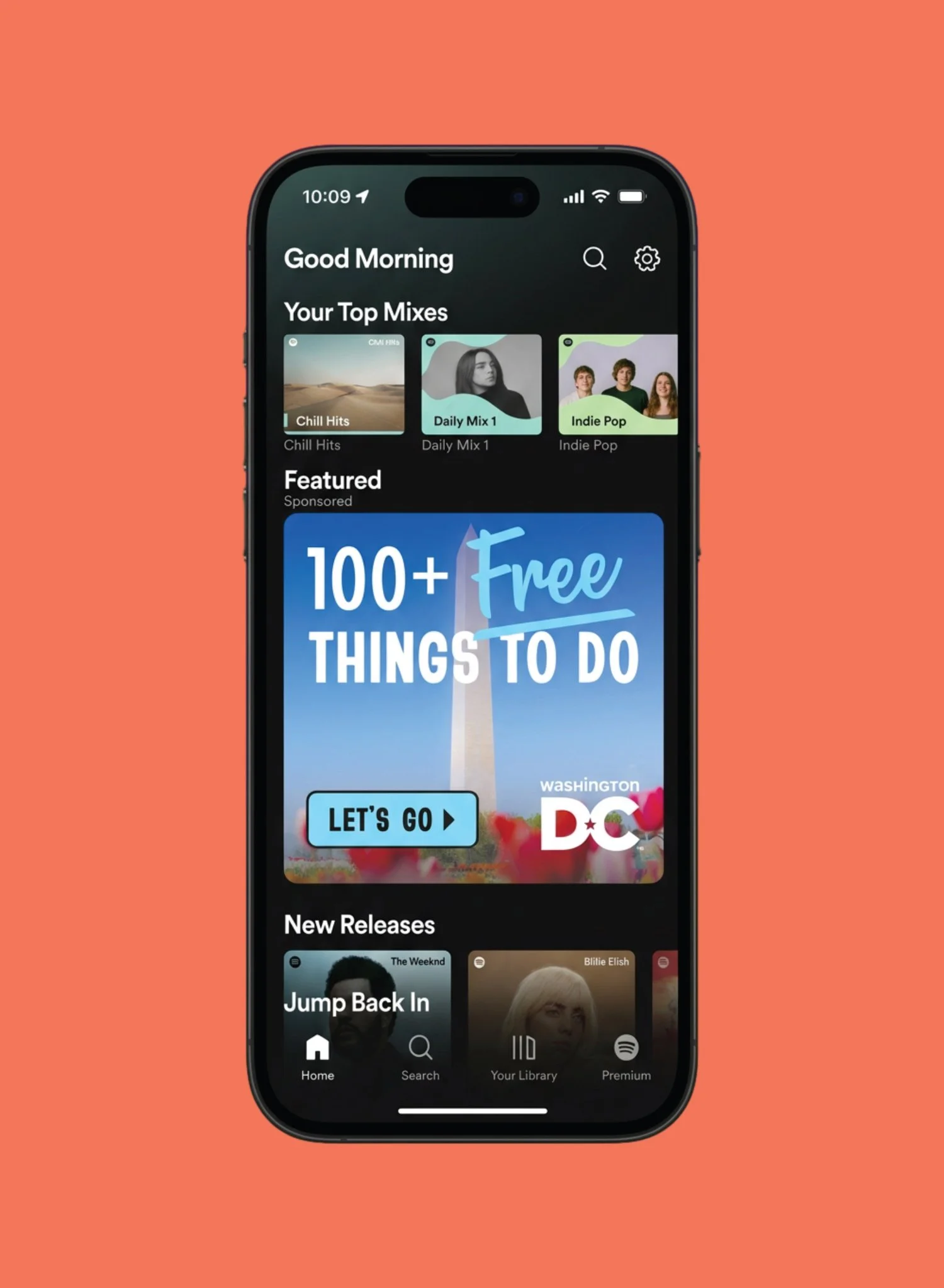
· Spotify Static Ad Designs
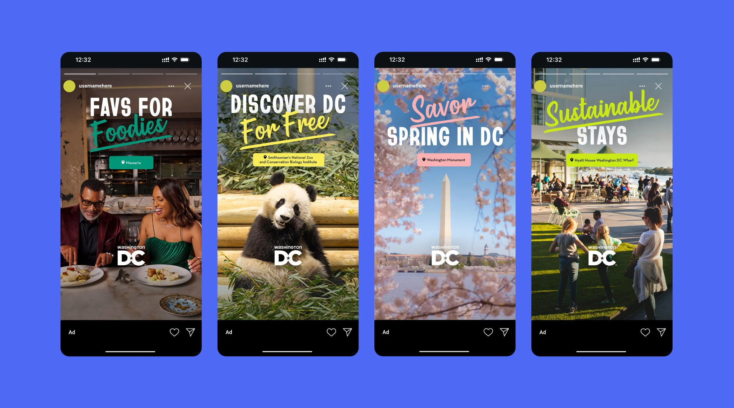
· Meta Vertical Stories Design
THE CHALLENGE
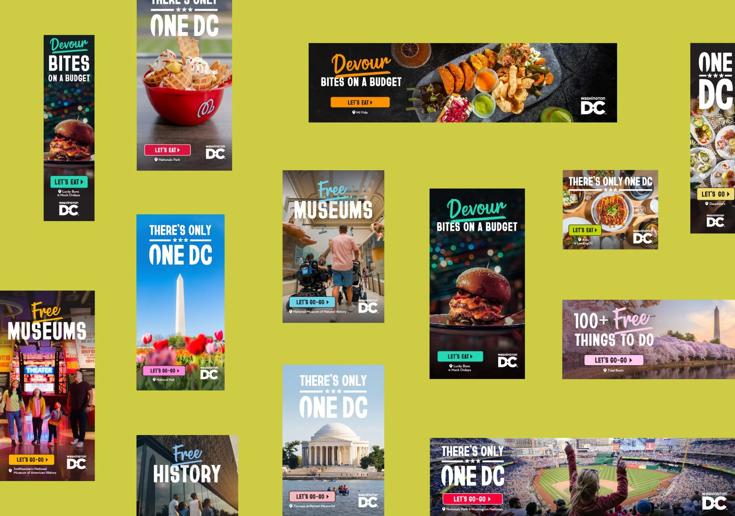
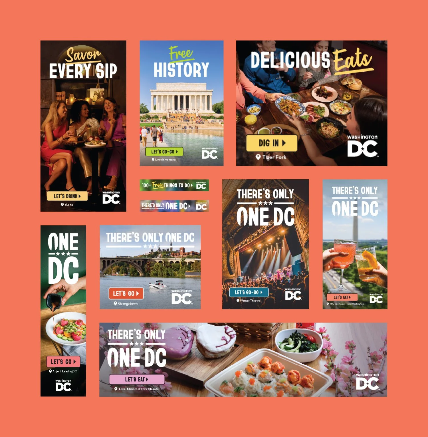
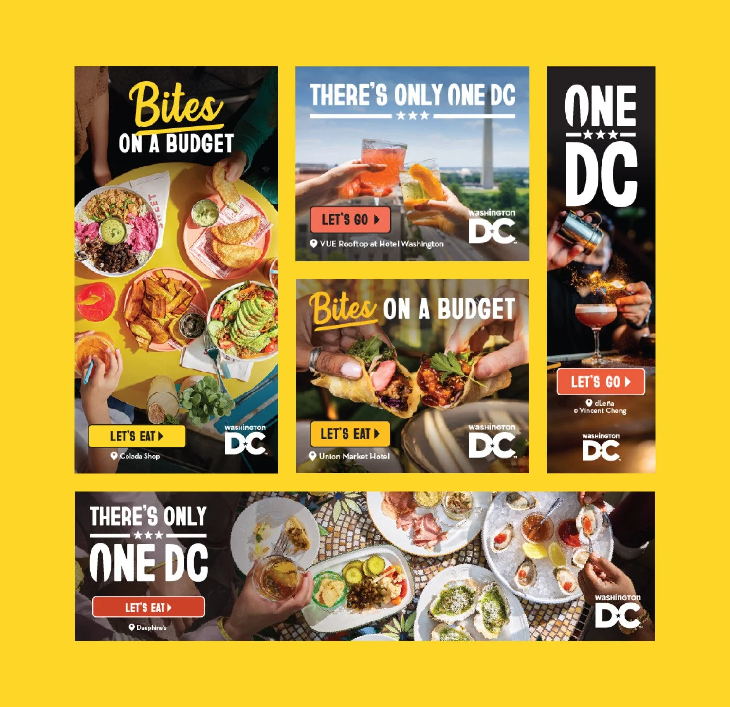
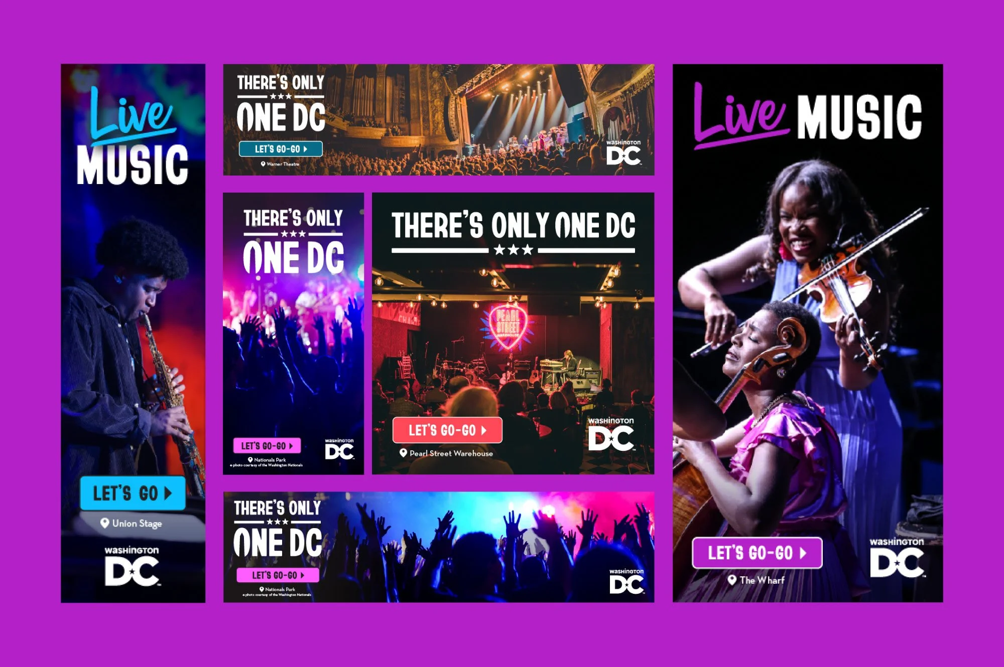
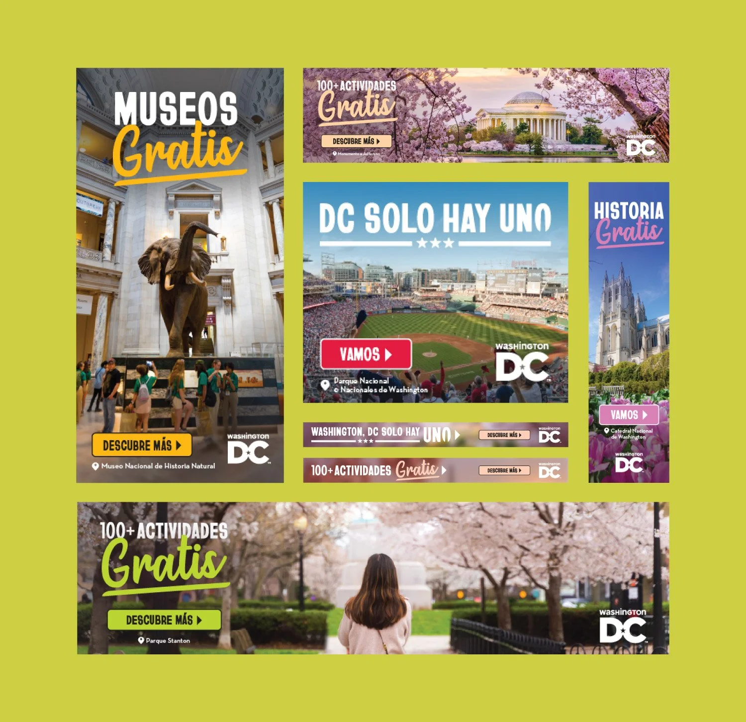
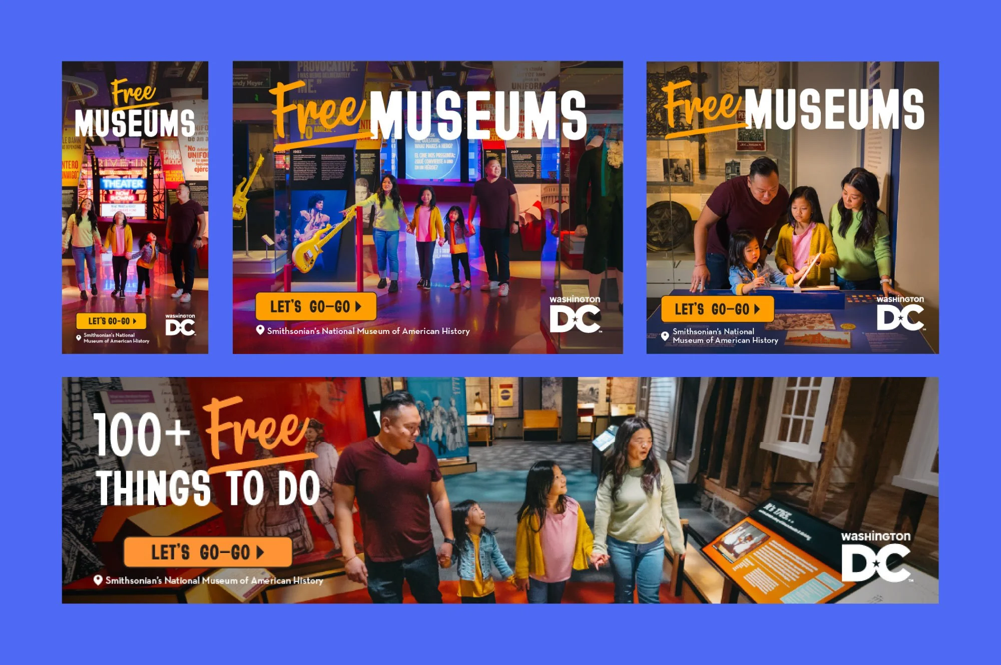
Designing a campaign at this scale requires more than creative instinct. With 12 distinct target audiences spanning history and culture enthusiasts, foodies, nightlife seekers, and more, every ad had to speak directly to a specific person without losing the cohesion of the broader campaign. Each audience suite demanded its own visual perspective, rooted in what would resonate most with that particular traveler and their relationship with the city.
The technical complexity matched the creative scope. Ads were required across 13 different dimensions on average, delivered as both static files and HTML5 where applicable, each format carrying its own production requirements and constraints. Keeping design quality, accessibility standards, and visual consistency sharp across hundreds of individual files was the kind of challenge that sharpens every skill at once.
THE STRATEGIC APPROACH
Before focusing on the design process, she immersed herself in the target audience personas and briefs shared by the marketing team. Understanding who each audience was, what motivated them, and what version of DC would resonate most with their interests became the strategic foundation for every creative decision that followed. Each audience segment was approached individually, with photography, messaging, and layout intentionally shaped to feel relevant and personal.
Accessibility and inclusivity were embedded as core design principles from the start. Every element was considered with clarity, usability, and representation in mind, shaping a system that could adapt seamlessly across formats and audiences while maintaining consistency and impact.
THE DESIGN PROCESS
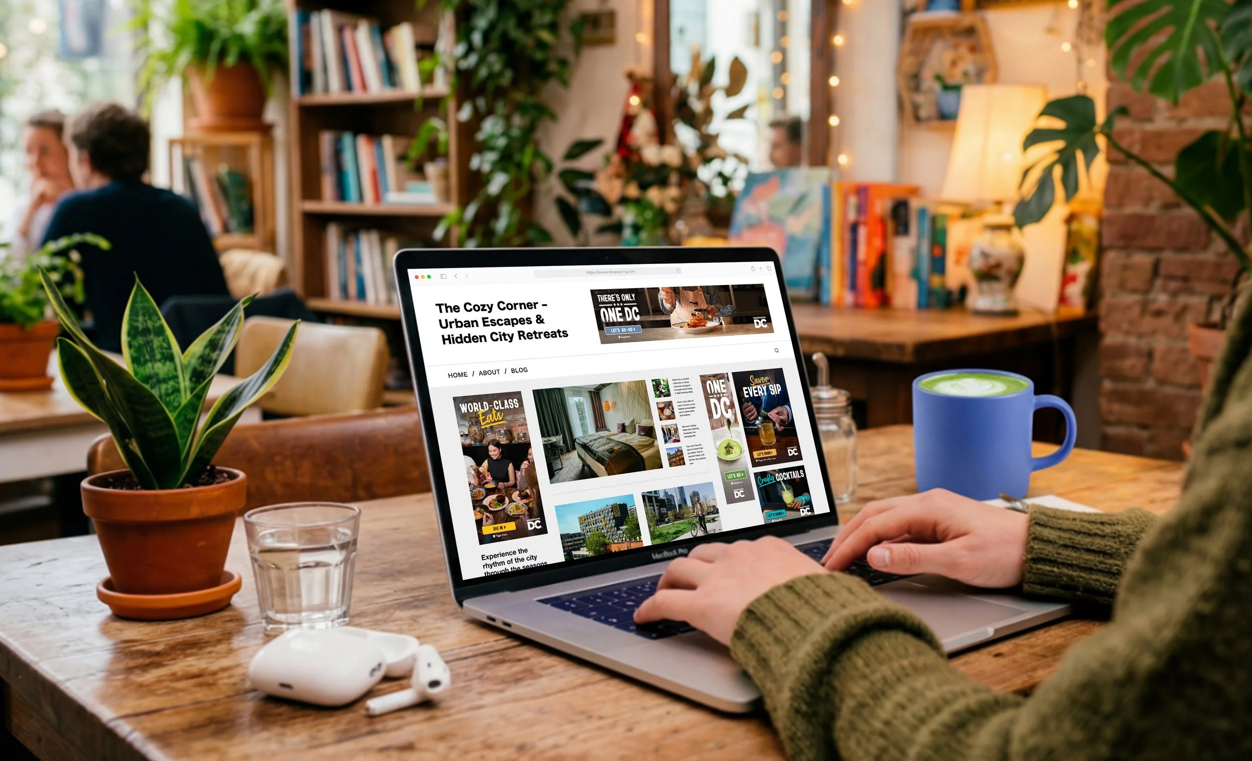
With the audience strategy defined, she moved into designing the ad system. Photography became a central driver of the work, with each image selected to capture the energy of DC in spring: from cherry blossoms and dining to museums, landmarks, and cultural moments, while aligning with the audience it was meant to engage. Composition, messaging, and CTAs were carefully orchestrated to work in unison, creating clear, cohesive visuals that guided attention with intention.
Accessibility and inclusivity were prioritized as core visual considerations. Color contrast, button visibility, representation, and legibility across formats informed key decisions, strengthening clarity and reach. CTA buttons were reinforced with outlined treatments to enhance visibility and ensure consistent recognition across placements.
Across an average of 13 dimensions, each ad required its own layout, hierarchy, and composition. A 970x250 leaderboard communicates very differently from a 320x480 interstitial, and each format was designed to deliver a seamless and engaging viewing experience. HTML5 executions introduced motion as an added layer of engagement, leveraging pre-existing templates while adapting to size-specific animation variations to capture attention effectively. To ensure the campaign reached DC's Spanish-speaking audience, ads were also produced in Spanish, with messaging carefully adapted to maintain the same tone, clarity, and visual impact as the English versions.
The 9:16 Meta carousel stories brought the campaign into a scrollable, immersive social format, with each slide functioning both as part of a sequence and as a standalone asset. Two Spotify placements further expanded the system, translating the visual language into a distinct listening context. Throughout production, she collaborated closely with the project manager, marketing team, and creative directors, presenting her work in progress and refining each round based on feedback before final approval from the Chief Marketing Officer.
THE OUTCOME
The completed spring campaign gave Destination DC a comprehensive, fully realized digital advertising presence across every major format their audience would encounter. Every ad, from the largest desktop leaderboard to the smallest mobile banner, reflected the same considered creative vision: photography chosen with purpose, messaging placed for maximum impact, and accessibility woven into every design decision.
The ads collectively gave each of its 12 audiences a version of the city that felt made specifically for them. In addition, the spring ads drove a markedly higher level of engagement compared to the previous year, signaling a clear and meaningful uplift in how audiences responded to the creative across all formats.
12 unique audience personas informed every design decision across the full ad campaign.
Accessibility and inclusivity embedded into every design decision.
31 ads produced in Spanish, ensuring the campaign reached and resonated with DC's Spanish-speaking audience.
Total of 286 ads delivered across 13 dimensions, and multiple formats including static, HTML5, Spotify, and Meta carousel stories.
In the Client’s Words
« You are a champion and a powerhouse designer! Such amazing work on the Spring display banner ads, it's really crazy. Thank you, thank you!!! »
ALEX GNAFAKIS
Senior Creative Director | Destination DC
« Yasmine is a ROCKSTAR.
We have been so lucky to have her work on our Spring display banner ads. »
J'NAY PENN
Associate Creative Director | Destination DC