A meaningful brand identity designed to capture the soul of a travel photographer and the women she inspires.
Brianna Cariola is a photographer whose work lives at the intersection of wanderlust, authenticity, and visual storytelling. Her photography not only documents travel, but also invites young women to pursue their own genuine adventures. Starting from scratch, the project called for building a complete brand identity from the ground up, with a visual language as elegant, timeless, and nature-inspired as the images she creates, designed to grow with her and resonate with the audience she was building.
OVERVIEW
STACK
Illustrator
Photoshop
InDesign
CLIENT
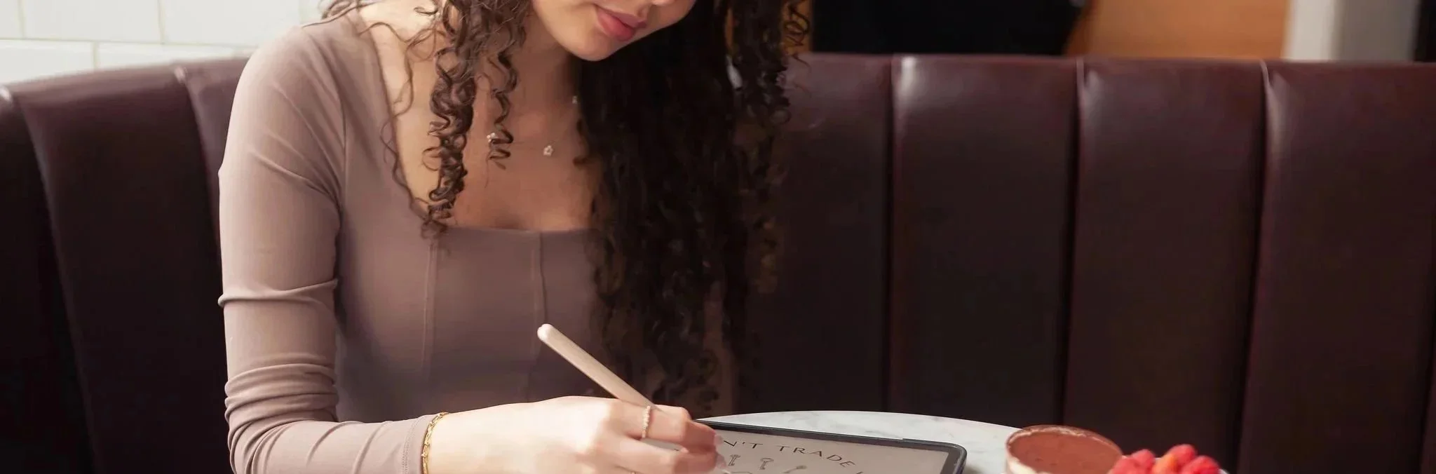
Brianna Cariola Photography
CREDITS
↓ Yasmine Bouchlaghem
Creative Direction · Brand Identity · Brand Strategy · Logo Design · Pattern Design · Project Management
INDUSTRY
Creative Media & Communications
SERVICES
· Brand Identity Design
· Logo Design
· Brand Strategy
· Pattern Design
THE CHALLENGE
Photography is a saturated market, and standing out requires more than beautiful images. With no existing brand to build from, everything needed to be created and decided, from the visual language and logo system to the custom typography, color palette, iconography, and patterns. The identity had to feel cohesive and considered across every touchpoint while remaining flexible enough to serve a business that lives across social media, print, and physical brand materials simultaneously.
The deeper challenge was translating something as personal as Brianna’s creative vision into a structured visual system with real longevity. Her brand needed to feel elegant, timeless, and inviting.
THE STRATEGIC APPROACH
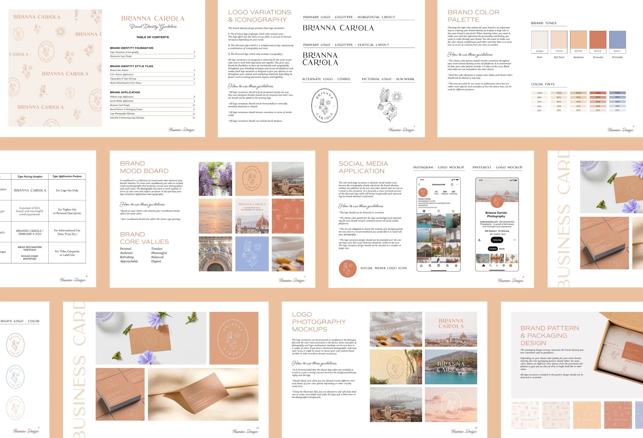
Before any design work began, the process focused on defining the brand’s foundation. Brianna’s keywords: authentic, timeless, meaningful, refreshing, nature-inspired, elegant, balanced, personal, and approachable, served as guiding principles and established the criteria used to evaluate every design decision. Her three core brand values: storytelling, intention, and experience, shaped the conceptual direction of the identity from the outset and ensured that every element served a purpose beyond visual appeal.
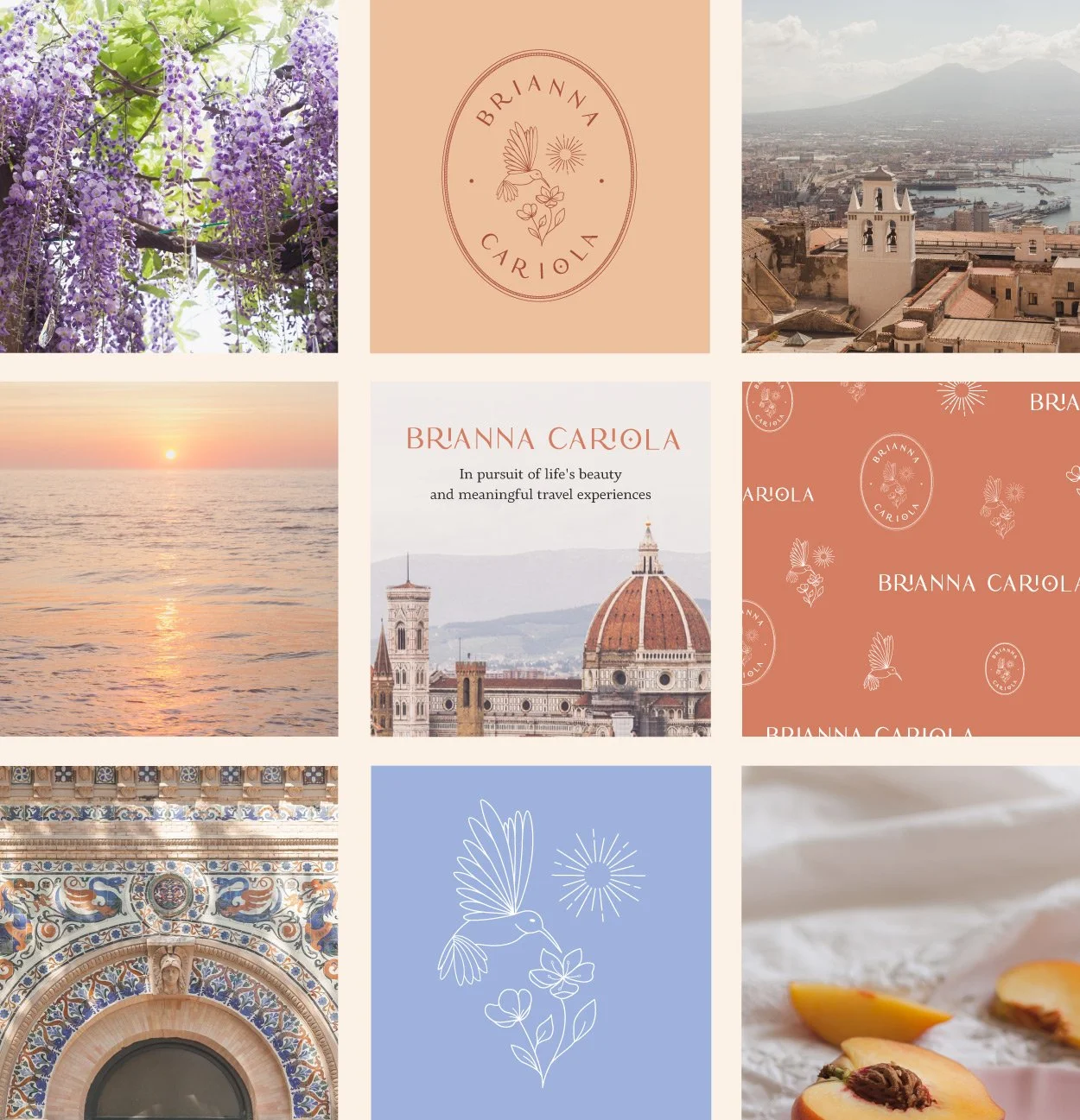
A mood board was developed to bring Brianna’s photography into direct conversation with the visual elements being considered for the brand. Warm terracotta tones, soft peach, periwinkle blue, and pearl hues, along with lush travel imagery and delicate natural forms, came together to define the visual world the identity would inhabit. This approach ensured that the direction felt genuinely connected to her work and her target audience, rather than something applied on top of it.
THE DESIGN PROCESS
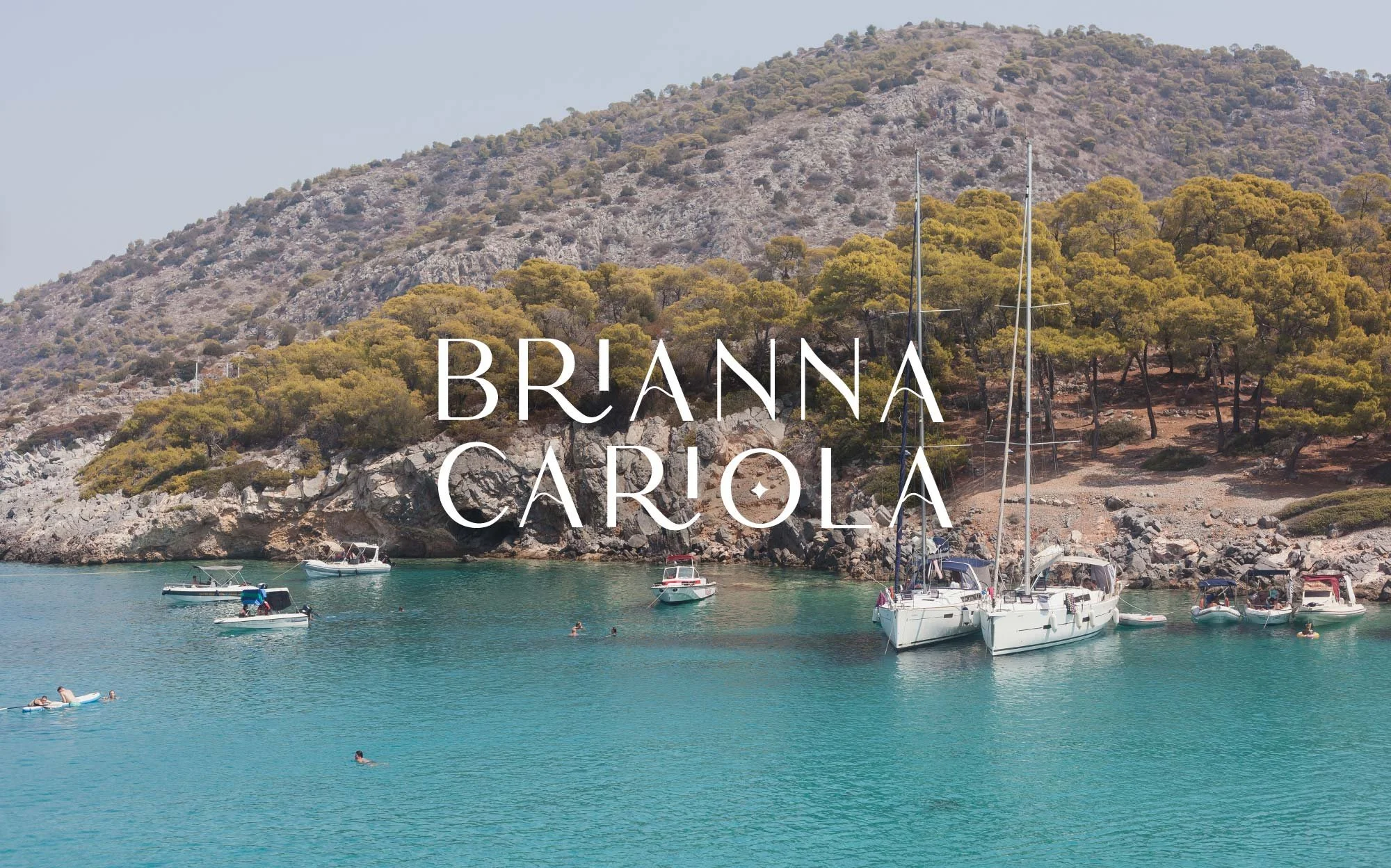
The color palette was built to mirror the soft warm and cool balance that defines Brianna's photographic style, ensuring the brand felt like a natural extension of her images rather than a separate design layer sitting alongside them. The logotype features a custom-designed typeface created specifically for Brianna's brand, with distinctive letterforms that give the identity a handcrafted quality and a deeply personal touch.
The iconography centered around a hummingbird in flight, wildflowers, and a sunburst, rendered in a delicate fine-line style designed to scale gracefully from a social media avatar to printed on packaging. Three logo variations were developed: the logotype, the alternate oval combination logo, and the pictorial sub-mark, each strategically designed with a specific purpose and platform in mind, so the brand felt personal and recognizable at every size and surface it would encounter.
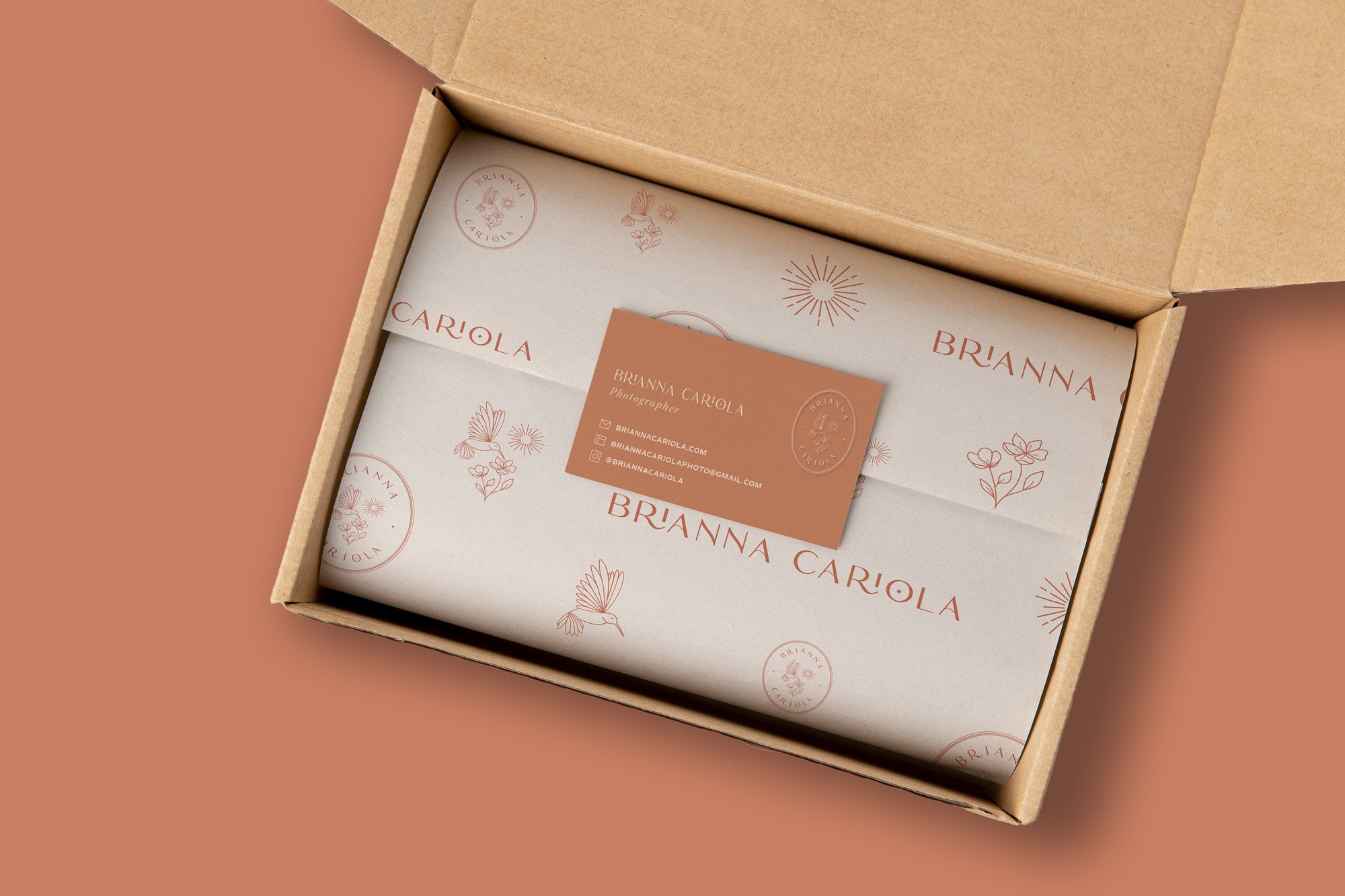
The custom pattern design brought all brand elements together into a cohesive repeating surface, applied across packaging to create a fully considered unboxing experience as her clients receive and unwrap their final printed photographs.
To bring the identity to life beyond the guidelines, brand in use mockups were created to show Brianna exactly how her identity would translate across real-world touchpoints, from business cards and packaging to photography overlays and social media, giving her a tangible and inspiring vision of her brand in practice. Every decision was documented in a comprehensive brand guideline deck designed to keep the identity consistent long after the project closed.
THE OUTCOME
Starting from the ground up, Brianna walked away with a complete, fully unique brand identity built to represent her photography business at every level. Every element, from the custom logotype and fine-line iconography to the three-variation logo suite, pattern system, and comprehensive brand guidelines, was designed to work together as a cohesive whole while remaining flexible enough to show up consistently as her brand continues to grow. The guidelines were thoughtfully developed to give her the clarity and structure needed to confidently apply her branding across social media and her website, empowering her to maintain consistency and bring her brand to life independently.
Included a custom-designed logo created exclusively for the brand
A complete brand identity built entirely from scratch across 6 deliverables
Delivered with a comprehensive brand guideline deck and real-world mockups for seamless brand application
In the Client’s Words
« Yasmine truly went above and beyond in this project to perfectly capture my photographic style, personality and values! Like in everything she does, she put her heart and soul into every aspect of the process, and created designs that I completely resonate with. She took immense care in capturing the essence of my brand, and her passion clearly shines through her work. Thank you so much for everything! »
BRIANNA CARIOLA
Owner | Brianna Cariola Photography